Friday, September 28, 2012

final touches on "john"

i finally got back in the studio for a couple of hours this morning and was able to get most, if not all, of the remaining work on this portrait of "john" finished. over the last few days i added some serial glazes to the background including alizarin crimson permanent, cobalt blue, raw sienna, and some ultramarine blue ot the top. this got the background to the hue and value that i think will work. it has a little more of a transparent glow in person than shown in this photo.


i added a few more washes to the cane trying to preserve the highlight as i went along. some of the modeling and shadow on the hands came next using first the cadmium red light, raw sienna, and cerulean blue to bring the areas up to value and then a light glaze of ultramarine blue to cool it off just a little and make those areas recede some. the buttons and the shadows on the watchband were ultramarine blue and burnt sienna to make a dark almost black. i lost some of the edges of these small shapes most notably on one edge of the buttons. i like these small notes of dark leading the eye up from the bottom of the painting to the face and hands.


the bulk of the time was spent in getting the checkered pattern on his shirt. i gave it quite a bit of definition at the top near his shoulders and gradually let it fade away as i went inferiorly. this was more or less in keeping with my initial plan to lose value and definition near the bottom. i painted these checks with criss-crossing lines of cerulean blue tempered with alizarin crimson amd raw sienna to break the color up a little. a few darker shadows on the shirt were added and i put down my brush to take stock of where i was at this time.

the truth is that i don't know what else i would do except to perhaps soften the edge at the bottom of the background shape to john's *left*. if i still feel that way tomorrow i will declare this done.

my thanks again to barbara tester for her photo of this beloved man. it was an honor to be given the opportunity to paint his portrait.


"those cherished memories linger"  20"X15"


Tuesday, September 25, 2012

carrying on with "john"

the first order of business today is to correct a mistake i made regarding the subject's eyes. the photographer and good friend of the subject disabused me of the notion that his eyes were blue....they were brown. so i put a wash of burnt umber over the irises, careful to maintain the highlight, and will have to darken the pupil somewhat before all is said and done.  thank you, barbara.

i then moved on to the face and felt that the values of the warm colors were about right and it was time to push them back and cool them off a bit. this was accomplished by a light glaze of ultramarine blue over those areas. this was a technique that i picked up from ted nuttall at the workshop and has rather quickly become a favorite staple. i really think more work on the face will not improve anything so i will let it rest and give it a final careful look nearer the end.

the next work involved the hands which were modeled with the usual "flesh" colors along with the arm, all painted with the #16 round cosmotop.  i then decided to further add and darken the shadows on his shirt. this was accomplished with cerulean blue, alizarin crimson permanent, and raw sienna. i usually made this up into a neutral gray (incompletely mixed) on the palette and then charged in one or two of the colors after the basic shape is laid down. this last for interest and to break up the monotone. i played around a little more with the pattern on his shirt and i like the way it darkens the value around his face and hands and gives some texture. how far down i will carry it remains to be seen, but i doubt it will from shoulders to the tail. at this point i am going quite slowly as this is where i can make some rash decisions and the painting could start going south. the whole thing is just a bit insipid at this point but some color in the background and darks in the shirt will help bring it together. i am going to put a "string" of small darks up from the bottom near the midline in the form of some dark buttons (such as the one just below his *left* hand) and the crevices on his watchband.

the last task accomplished today was to get a couple of washes on his cane. i wanted to leave the highlight so i painted on eithr side of it with burnt and raw sienna and a touch of burnt umber. the rings were pretty much pure burnt umber and give another trail of darks into the center of the painting and toward his hands and, ultimately, face.

after this was done i took a look at the painting from about 25 feet away and decided that his hair was too dark and made him look younger than he really was. to try to mitigate this i lifted off some lighter strands here and there using a thirsty flat, 3/4", flat synthetic brush. this is the only change from the above photo and the final one. i may have gotten too carried away but, again, i will take stock nearer the end and see how values align then. not to panic; all is fixable at this point and i don't think any fatal mistakes have been made.

the background is lagging a little  far behind the figure so next time i will start to bring it back up to "speed." cheers for now.

Saturday, September 22, 2012

finishing "oh, to be older," and starting another.

"oh, to be older," (15"X11")


i did finish the painting started last posting. it really required very little and to be truthful, while i know i did something, i can't remember what it was. so here is the end result.


drawing

the inspiration and/or model for this next painting was provided by a photo by barbara tester and found on "paint my photo." it was entitled "a man called john." i started by drawing the face and figure using a modified contour technique onto a piece of 300# hot press arches paper measuring 15"X20". 

i started the painting by putting a high value wash of cadmium red light, raw sienna, and cerulean blue using my #26 round cosmotop brush and covering the face arms and part of the upper backgound.
i kept this pretty light as his over-all complexion appears quite pale. when this was almost dry i put in the basic shape of the hair with cerulean blue and burnt sienna.

using the same colors but in different proportions and switching to a #16 round cosmotop, i painted the nose and right eye. cobalt blue was used for the iris and a dark value ultramarine blue and burnt sienna for the pupil (same for the *left* eyebrow). i lost the lower outside edge of the pupil in each eye and was careful to paint around the highlights.

i then started modeling the nooks, crannies, and creases on his face using the same flesh colors and losing some edges here and there. i noticed that i had not drawn the shirt and neck correctly on his *right* side so i put in a dark neck wash to redefine the extent of his shirt. this clearly dried too dark and will probably have to be corrected, but i will wait until more is finished before making a decision.

i put a first wash on the background in the upper right of the picture using raw sienna/umber going toward an ultramarine blue near his shoulder. 

to finish out work today i finished the *right* eye in much the same manner as the *left*, did some more modeling on the face, put in some of the shadows on his gingham shirt and played around with the checkered pattern a bit using cerulean blue charged with various tints of alizarin crimson permanent and raw sienna. the shadows were the same colors. some of background to left of the figure was put in with raw sienna/unber (i slash there descriptions because i have both colors in opposite ends of the same well so there is a bit of cross-contamination.) that doesn't really bother me although i will admit it will bother some.


so, here is where we stand on this, the first, day of painting. hopefully it will do justice to the wonderful photo taken by barbara tester.


Thursday, September 20, 2012

new painting: "oh, to be older"

inspiration image
this next project bears some explanation in respect to why i composed it the way that i did. for sure it is unconventional and those who espouse classical composition rules will surely find much to criticize. but there is some method to this madness.
in this source photo of our grand daughter sophie, i caught her looking longingly up toward something while in her pj's, eavesdropping on the adults, and waiting to go to bed.  in the painting i wanted to emphasize her small stature, her longing expression , and leave the object of her gaze a mystery to be filled in by the observer. i decided that much of her body was unnecessary to convey the first two objectives and cropping out her dad would solve the latter. then i just had to decide where on the paper and what shape paper i was going to use. the vertical "portrait" orientation and not too big said 15"X11" to me. also, i would be lying if i didn't say i had a piece of hot press, 300# paper that exact size laying around, and frugality dictated the rest!  the last decision put her head and neck in the lower left of the page looking up and to the right. this, in my opinion left the picture a little unbalanced so i added the diagonally placed stripe along the far right of the painting.

so here is the drawing and the first light multicolored wash. please ignore the dark splotch of paint in the upper right from a previous misadventure that i'm pretty sure subsequent washes will cover sufficiently so as to make it irrelevant, hopefully.

i painted the features with my "new" #16 cosmotop round brush using scarlet lake, cadmium orange, and cerulean blue. i started with the nose and then moved to the bilateral eyes. cobalt blue was used for the irises. the small areas of arbitrary color is a light touch of prussian blue. all the rest of the facial areas were painted with the "flesh" triade. a touch of burnt sienna wet-in-wet for the brows and then i moved onto the hair. it is quinacridone gold, burnt sienna and burnt umber. i let some of it expand into the background to her *left*. this may have been a mistake....we'll see...just part of the excitement.

i needed to let the background catch up with the portrait. i wanted the background to be a sort of grayed down violet-blue. i initially put down a wash of alizarin crimson permanent starting at eh top with my #26 round cosmotop and working to the bottom in a somewhat (intentionally) irregular manner to give it some texture. i put an initial wash of prussian blue on the far right vertical stripe.


i corrected some of the features that were a little out of place, due almost entirely to drawing errors, by gently lifting and blotting, drying, and re-applying paint in the "correct" area. this was primarily correcting the shape of her *left* iris, the tilt of her nose, and lowering her mouth. this latter was most difficult because of her teeth. i think it is okay, but the whole thing is a bit sloppy and "make do." i need to have a better last minute perusal of the drawing in the future.

there are a couple of coats of ultramarine blue over the initial alizarin crimson in the background and a few dabs of paint in her hair. another layer of prussian blue was necessary to bring the stripe back to the value and hue i wanted.

i painted in the pattern on her nightie with the #16 round and cerulean blue. i grayed down the background with a light wash of raw sienna. this is getting very close to where i want it so i need to proceed with some caution. i believe some more texture in her hair and perhaps a wayward strand should finish it out. some dark detailing on the lace around her neck might also be a nice accent. the shadow on her upper *left* lip seems a little dark in this photo. i will check it on the original before making a decision to lighten it.
 

"oh, to be older"  (15"X11") almost done

Tuesday, September 18, 2012

finishing up most recent portrait

step #1
stage #2
i have been a little like a kid in a candy store lately trying out some new techniques that i (re)learned at the nuttall workshop. except for some work on the pupils, and correcting a bit around her mouth, the face was done at the last sitting. so i really had just the shirt and the background to deal with. in the last post i said that i wanted to go with a minimalist approach and as i got carried away with the multiple glazes deal that plan went pretty much out the window. these steps show the progress through to the penultimate and finally ultimate stage. i will comment where appropriate but suffice it to say that i added alternate warm and cool glazes applied with a light touch and no going back to fix anything until they had dried completely. additionally i rather liked the red accent line to either side of her head and i had to keep going back to re-state it as i lost its relative brightness with the surrounding washes.

in the penultimate version it was clear to me that the inferior edge of the descending dark wash along the sides ended just a little abruptly and the shadow on the near shoulder was too dark and quite distracting. so i gently lifted these back to where i thought they worked with the whole better.
penultimate stage
 
"never far from wounded knee"  (15"X20")


Saturday, September 15, 2012

ted nuttall workshop day #4 and a second painting

as i indicated yesterday i did get a chance to start another painting during the last day and an hour of the workshop. i decided with ted's suggestion to have another go on the portrait of marlene from pine ridge reservation. i have painted her a number of times. although i have been fairly happy with two of them, they did leave me wanting to do a better job once i had the opportunity (read skills). i had drawn her likeness on a piece of 15"X20", #300, hot press arches paper.

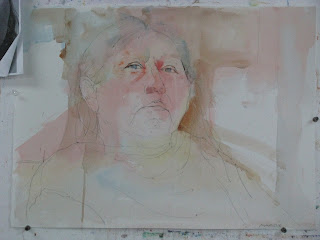
drawing and first washes
i started out by putting a light wash of flesh type colors and let them mingle on the paper. these were scarlet lake, cadmium orange, and cerulean blue. while these are typically ones that might be used fro caucasian skin i will have to find a way to darken it a bit as i move along, although her features say lakota pretty strongly. i carried this was over to the edge of the paper in few places and down into her clothing. after that dried, i put in a slightly darker wash of ultramarine blue and burnt sienna over the hair area. i used a #26 round dynasty cosmotop f brush for this. this needed to be bone dry before proceeding.
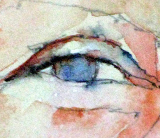
eye detail
next step #1
i started the features with the eyes. same colors, but with #16 round brush of same make and model. the fold above the eye and under the upper lid with a darker version of the mixed flesh color. i added some arbitrary color as i moved along and i couldn't tell you exactly what i used but i suspect it was hooker's green, mineral violet, alizarin crimson, and even cadmium red light in places. this just for interest. the iris was painted with burnt umber , switching to cobalt blue in spots and then puling the pigment down to the lower lid with a damp clean brush. the shape of the iris as i goes behind the lower lid defines the lower lid placement and shape. i then pulled that pigment across to further define the lower lid. the rest of the socket shapes were then added. all of these washes on the skin were about 10-15% pigment, so light in value. next i moved on to the nose, followed closely by other form shadows on her face.  the rest of the progress i will document with serial photos of progress with minimal description unless something truly significant comes to my mind as i upload the images.


so, what's different? well, up until now i didn't handle multiple light washes on top of each other.
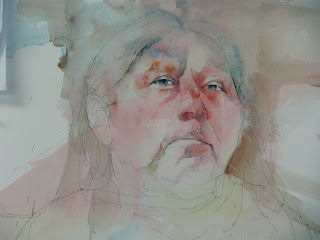
next step #2
they became muddled and muddy. i suspect that both they and i were too heavy (handed in my case). now i seem to be able to get them down, one atop the other, without much trouble. although i have put as many 6-8 "coats" on some of this it still remains fresh, transparent, and (dare i say it?) loose. another difference is that i am being much more judicious about the use of arbitrary color. it had gotten to the point that in my zeal for color that the blues, violets, and at times, greens looked more like paint on their faces than subtle shading. if you look closely there is mineral violet, hooker's green, and cerulean blue present but it isn't overpowering. perhaps the last major difference is that i put the warm pigments down (not worrying about color) until i had them built up to the correct value and then brought them to the "proper" temperature with a light glaze of ultramarine blue. this rarely changed the value but cooled down the intensity of the reds. the result was a pretty good approximation of marlene's skin color and added to describing her facial structure.

i think the face is just about done. i need to do some work on the hair and decide on what to add to the already subtle background shapes. i have already decided to go with a minimalist approach to her shirt letting pigment sort of "peter" out as i worked down to the bottom.
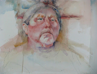
final step before adjournment of workshop

i packed up at 4pm wishing that i had another day, or two, or a week. ted is a great guy and excellent teacher. his last day session on composition was eye-opening and may have been one of the high points for me. no dogma , except to maybe ignore much of it. from starting with the size and shape of the paper that helps him say what he wants with the painting, to the placement of the figures on the sheet, to the cropping of the photos before hand on photoshop, all are invaluable lessons almost worth the price of admission on their own....okay, not really....but quite practical. i am looking forward to his trip to la crosse next june


Friday, September 14, 2012

ted nuttall workshop day #3: a finished painting...sorta

another great day for weather and painting.

we talked about shadows, both form and cast. some of this i knew but occasionally forget in the heat of "battle" and some was new. some obvious differences, like hard edges on cast shadows and more gradual transitions on form shadows (unless they are on a box or turning around a very sharp edge.) another thing that i might have known had i thought about it more was that shadows can be colorful, but always take on the chroma of the underlying surface upon which they fall whether they be cast or form. they must be lower in value (ie, darker). now i was dozing abit a one point and i think i caught the tail end of the following: the lightest lights in a dark (like shadow) should still be darker than the darkest darks in the light. this was told to be by charles reid, so i think it probably is true and re-iterated by ted here today....but of course i could be wrong.....i was snoozing (just a little bit).

so, i did as much as i was going to do on the first painting and started on the second with about one hour to go this afternoon.

"in search of a husband" 14"X 17"
the major thing with the thai girl painting was to just view the over all thing from about 20 feet away and look for things that bothered me or i found distracting. i decided that there were a few places that needed some darkening and the white on the bottom of the bar she had her arm draped across was very distracting. so i placed some darks in the corner of her mouth in shadow and put a greyish-blue light value wash over the white at the bottom of the bar/railing. here is the final phot of this and i will move on to the next. again, my thanks to babasteve for the use of his wonderful photo as a reference.

i think i will just post the photos of the next painting tomorrow to break up the two processes although the first photo shows the effort from today.

Wednesday, September 12, 2012

ted nuttall workshop day #2

another lovely day here. lecturing this morning, ted gave brief discussions of how he paints the features on the face, like eyes, noses, mouths, teeth, hair. the first thing that i took away was that each feature should be painted as if it was a miniature abstract painting done in the style of the whole of the painting. so lots of connections, lost and found edges, etc. so that when one was done with , say, and eye, if one were to crop the painting to include only the eye and enlarge it, it would be a good painting in and of itself. after that he did a demo and both described his thinking and showed us how he paints the backgrounds. this is basically 6-12, 10% glazes done wet on dry to build up value and get a nice transparent glow. i have never done this before. i did do a wet on wet glaze of about 3 layers on one painting. it was sort of the same idea in execution but much different in outcome.

so here are two stages of the painting that i started yesterday (i did edit yesterday's post to include the steps done then as the photo up-loader was working again. yeh!). enjoy....i am.

 this background step has only 2 and 3 layers, repsectively. quinacridone gold first in an abstract shape wash near the figure, then ultramarine blue over all to push that back, and followed by cadmium orange on the left and permanent alizarin crimson on the right. the orange to grey down and remove the "sweetness" of the blue. i had a good reason for the red at the time but i have lost now!

i started work on the tapestry right at the end, but the tediouness of it wore me down late in the afternoon so it will be first on my agenda tomorrow.

i will probably finish this or at least stop on this tomorrow and start another.

this is a perfect experience for me at this stage
of my development.

Tuesday, September 11, 2012

ted nuttall workshop: day #1

we spent the morning, after introductions, etc., learning about ted's philosophy on art and painting. i think the biggest thing that i took away from this is to enjoy the journey; that it isn't uncommon to dislike the outcome at first but at least you have the memories of the process. so enjoy the process. that doesn't mean that it has to be "fun" in the usual, barrel-of-monkeys sense, but at least something from which one gains satisfaction as time well spent. i think that i would have stopped long ago if the end result of the painting process was what spurred me on....just haven't had that many awe-inspiring paintings issue from my brush yet; but, my oh my, the sights along the way!

i was so engrossed in the process of the painting once he turned us loose with brush and paint that i forgot to take as many pictures as i intended. i do have two, however, and will post them here. i elected to go with the thai girl with the neck rings from a photo by babsteve (flickr) of which i did a sketch about a week ago. ted's process is very layer-upon-layer oriented and therefore much different from the rather alla prima approach i learned while studying with charles reid. this will make me slow down and i think that will be good. i have already learned something just from the drawing process which included much more detail than i have in past. the drawing process probably took twice as long as i might have before this exercise (about 90 minutes as opposed to perhaps 35-45 minutes). the modified contour type of drawing is the same which puts one in a painting frame of mind, but the amont of detail and careful "proportioning" is much more deliberate. when i started painting i could see the benefit right away as i knew exactly where i wanted to put a particular wash. i still consulted the photo for edges and value, but the location was  much less tentative. as you can see from the photos, most of the washes were 10-15 "percent"-ers. he also relies much less on gimmicks than other paitnters especially for me, not scraping for the hair strands. hmmm, this will be like going cold turkey for a smoker. i might have to join sa....scrapers anonymous. so, here are two stages of the painting after the inital washes and then about 60 minutes later with some of the first over-glazing.

i have to apologize as my version of blogger isn't cooperating this morning and won't upload photos from photoshop or my desktop. i'll try again later, and if successful, will edit this post.


sorry.  halleluia! it works this morning. here are the two stages i was talking about.

Monday, September 3, 2012

finishing 2 derelict projects and heading for the bin?

as the workshop with ted nuttall approaches (just one week now) and needing to get some pre-drawings done, i am determined to finish the two paintings that i stated some time ago. they are the the "posing proud in hobart" and "stories of my people".

penultimate steps in "posing proud in hobart"

"posing proud in hobart" 15"X20"
in respect to "posing proud in hobart", i finished out the area to the side of the building with a fence, and stack of wooden sticks. in retrospect i didn't need to make anything up as they were in the original photo and i decided to go with it for lack of any better idea. next, i painted the ground as it came forward from the building and the fence in the background. the thing here was to get it come forward. there are a number of ways to do this. one is to make the value darker as you move to the bottom of the paper (dark things, in this instance, advance). one can place more distinct and larger objects like grass, rocks/pebbles/other
debris in the foreground. warm colors advance so i
could put more reds, yellows, browns near the bottom and cooler colors like blues, cool greens, etc. farther up (back) in the picture. there really isn't enough distance to give any atmospheric perspective (relative bluing of the light as objects get farther away.) i decided to go with a few of the former and i think it works. i did use some cooler near in terms of the bluer stuff but it was darker and larger shapes that circumvented the color temperature thing. some texture to the weathered board,  spatters over both the building foreground, and some shadow shapes on the building finished this out.

"stories of my people" 16"X20"
switching to "stories of my people" which is really a portrait of annabel, i needed to finish her *left* hand. using the colors that i think i used (its been so long) which are brown madder, burnt umber, and cobalt blue i modeled her hand loosely and filled in the creases such as life line, etc. i still had the background wall on the right side of the picture. i went with a variegated wash of ultramarine blue, burnt sienna, mineral violet, and maybe some cool green (not sure which, maybe oxide of chromium). my heart and mind really weren't in it at this point wanting to get on with the homework for the workshop, and i shows. this , if i am going to be honest and you forgive the vernacular, sucks. poor choice of colors, looks like an after thought, and appears to outline her hand rather than helping it blend into the scene. the only thing good i can say about it is that i got it on smoothly without any back runs. whether i can fix it with something glazed over the top is yet to be determined. i finished out this rather feeble attempt by painting the light switch., mainly with negative painting.

at this point part of a day and night have passed and they don't seems quite so bad to me.....the family one is setting better than the portrait, though. yesterday i thought the portrait was a goner and the family might be saved by some judicious cropping. so, time does heal some paintings. i think both need a few more nights of sleep before their final judgement.

on to my drawings on the 300# hot press paper recommended by ted nuttall for the also recommended detailed drawing on which to begin my workshop journey one week and two hours from now....but who is counting?