Monday, August 29, 2011

"sophie loves lola"

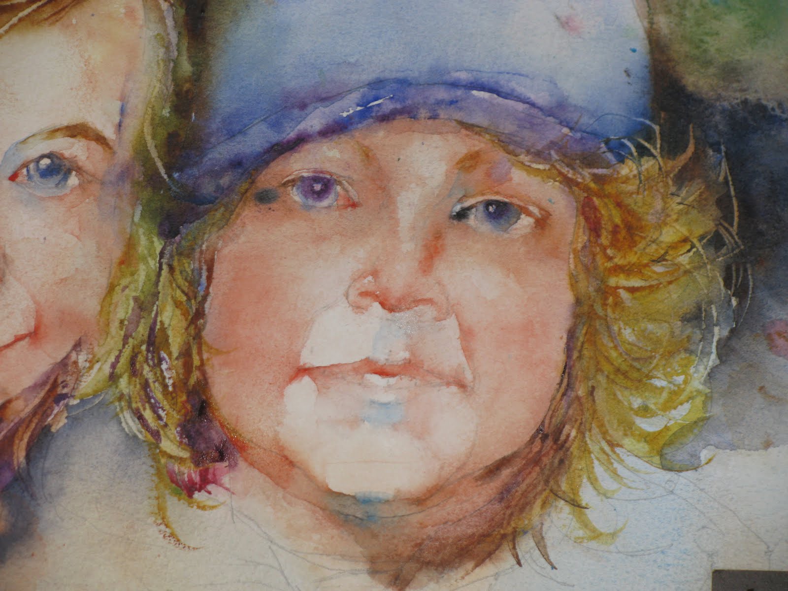
for this next painting i am going to use a photo of sophie, our granddaughter, and her cat lola taken by our daughter-in-law heidi and shown on her blog under the humble moon. sophie spent about a month with us wisconsinites visiting from her home in portland, oregon. when she got home lola was awaiting her and this is a depiction of their joyful reunion. i changed it to gray scale as i find it is easier to read values that way and i am also not such a slave to the colors. i can sort of make it up as i go along....within reason of course. in fact, i almost always do this or use a black and white photo if it is to be the inspiration for painting.

i started out drawing directly on a 16"X20" 140# cold press fabriano artisitico extra white sheet of paper. the technique was about 50% modified contour and 50% gestural type of drawing. here is the result before adding any paint....yes, i was able to restrain myself from splashing some paint on at my earliest convenience and before i had taken any photos of the drawing.....this time. no future promises. i purposely made the drawing darker in the photo than it is in real life so that it would show up here better. before starting painting i corrected a few things with sophie's hand and lightly erased some of the lines so that they would not be so intrusive in the finished painting. i do this by drawing the kneaded eraser down and across the paper from upper right to lower left in one direction.

to start the painting i took my #8 round with a good point and using cadmium red light, cadmium yellow pale , and cerulean blue painted in the shadow line under the upper lid of the far eye. i immediately put in the shadow in the socket above the previous line and drew it out over laterally with a damp, clean brush. the eyebrow was put in wet-in-wet with burnt umber and quinacridone gold. i wanted this to blend in with the hair so i put that in with the same colors as the brow and worked it down over lola's ear. i scraped in a few strands of hair when the wash was losing its sheen. i put in the iris with cobalt blue which grayed a bit with a blend from the shadow put in previously. i painted around the highlight and about half way down to the lower lid and then worked it all the way down with a brush cleaned and shaken of excess water. i watched this carefully and put in the pupil wet-in-wet with ultramarine blue and a touch of mineral violet. the under plane of the nose was put in with the same flesh colors and worked up and over the top and *right* side of the nose. a single upward stroke of a damp clean brush released the shadow shape into the upper lip. i kept working northward into the medial aspect of the mostly covered near eye socket with adding more cerulean blue as you can see. i then worked on lola's nose. i start there frequently with people, so why not with our feline friends? i will offer the caveat that i have never painted a cat before so we are plowing new ground here. it should be interesting. so, the tip on the nose was burnt sienna and a bit of ultramarine blue and the whole thing worked up toward the eyes and released it into the *left* "cheek." i defined the lower limit of lola's cheek? lip? whatever, with some of the same colors but strong on the blue and added more burnt sienna as i moved leftward on the picture surface. that's as far as i got and i had been painting for 20 minutes at that point...i set a timer as i found i (again) have been falling into the trap of painting until i was too tired and the water was as filthy as the palette. bad habits die hard. i'll start in again tomorrow. cheers.

Friday, August 26, 2011

"hey, that's jim's duck": finishing up

i had in tended to try to make a video of some of the painting process for some of the rest of this painting, but between my not knowing what i was doing in either the shooting or the editing and compounded by the fact that i finished a lot of this in small, quick sessions as i ducked into the studio on the way to something else ( and ended up late for that, of course), i didn't do it. i think that i have the basics down now so i will do some on the next project. so, here is where we are before starting work today. if you compare this to the last photo from wednesday you can see that i have picked  away at it and there is more finished now.


by the end of this current session which was about 30 minutes, only, i finished the duck decoy and the remaining few white flowers in the bouquet. the two lemons were painted with cadmium yellow light and quinacridone gold for the shadow parts. cast shadows with cobalt blue when? some remaining background stuff on the wall and window frame and the strip on the table cloth. i think that is the end of this painting. i wanted to stay a bit looser in this one compared the the previous one. i was pretty sure it would as i was now more comfortable and reacquainted with the subject and format, but also i think the set up was a bit less formal, as well. i was a little more messy than usual especially in the foreground from splashes while cleaning and shaking the brush. it really doesn't bother me and adds a bit to the somewhat raw,slightly unfinished nature of this, and a lot of other watercolors that i like. if this has inspired you have a go at it, it will be fun and you will be amazed at what you can learn about painting in the process. here's the finished painting:

"hey, that's jim's duck"

Wednesday, August 24, 2011

another still life : "hey, that's jim's duck"

while i was on a roll i decided to do another still life before i put the setups away and returned to decoys to their rightful owners. this one i think will be done with a little more limited palette and in the portrait format. here is the set up:
as you can see i put the light source behind and to the left of the set up. i also drew in a window frame to suggest a source of the light (outside window). when i set these up i try to make it very informal...sort of like what one might see on a table top as they walk around their home. just stuff left around waiting to be put away, etc.


i started by clipping a piece of 16"X20" fabriano artistico 140# cold press paper to a couple of pieces of foam core and using a modified (i look at the drawing form time to time) contour drawing technique put the image of the set up on the paper in the portrait configuration. i got pretty carried away with the painting part so there aren't many step by step sequences to share with you. i can say that i painted the mug and saucer first with cobalt blue and burnt sienna using a #10 round brush and the left edge of the mason jar with cerulean blue. i worked on the flowers some at that point using the same brush and my usual gray mixture of cerulean blue, alizarin crimson perm,. and raw sienna for the shadow shapes among the white flowers. these are almost back lit so i wanted some crisp white edges abutting the gray shadow areas. the center stamens were scratched out with a palette knife at the stage where the wash had just lost its sheen. when those dried sufficiently i put in the orange dots for their ends. the simpler shaped apple blossoms were modeled the same way but the center dark area was painted using hooker's green and burnt umber. i tried to arrange to lose the edges of the flowers on their shadow side as they came up against a like-valued dark deeper in the bouquet. the green leaves of the apple twigs were painted with olive green and quinacridone gold and the stems were painted in wet-in-wet with brown madder. the window frame will be various values of the gray mixture mentioned above. i started on the duck decoys back to define the right side of the mason jar and i wanted to make this more "rustic" than the previous rendering, so i let the colors mingle on the paper, left some whitish area, and scratched in a few lines. hopefully this will read as "old and abused." we'll see. a couple of last comments before i close for the day. i think the stems in the jar/water should be mostly hard edges. i sometimes see artists do these more wet-in-wet and then i don't feel that they read much more than a large blob. the wash on the orange id way too light but i wanted to see if the orange would work here at all. i think i will so i will paint i properly at a later date. the "outside" i am suggesting by a high valued, splattered, scumbled area of barely mixed cerulean blue and cadmium yellow medium. i think you can tell what i did on the mustard jar without iteration here. remember cast shadows right away.

Monday, August 22, 2011

"jim's decoy and daisies": finishing touches

there really isn't much left to finishing this painting. so, on to the rest of the bottle and decoy and the lemon slices on the cutting board.

i told myself that i was done with the flowers and now that i look at it i decided to reclaim some of the whites. there are enough that i didn't think lifting was going to do it so i elected to use white watercolor. gasp! yeah, i know there are those who think that an opaque, especially white, is heretical. well they also say to work from light to dark with numerous weak washes, too. i guess i have ignored that for long enough that this seems like a minor transgression, plus i think it will serve my purpose. because i shot this photo with a flash (it was night) you can see where the white is around the spout of the coffee pot and flowers at the bottom of the bouquet and also a bit around the top of the decoy's head. i hadn't intended to have this show (i think it also may have still been wet) but it did come out a bit reflective in the flash and therefore visible on the photo. so, i will let that speak for itself. using a #10 round i finished the bottle using quin. gold and olive green, again being careful to preserve some highlights and put a blush of something warm on the label. the decoy's body was painted with burnt sienna near the front and a combination of ultramarine blue and burnt sienna farther back. the cast shadow was put in right after that. the slices of lemon required a smaller brush so i changed to a #6 round and put in the outer rind with cadmium yellow medium, the inner pulp with a dilute raw sienna leaving a white bit between the two, and the cast shadow with cobalt blue.

"jim's decoy and daisies"
at this stage i looked things over and decided that the decoy needed to be darker, so i strengthened the color with mineral violet and burnt sienna on the breast and a darker version of the same colors i used previously on the anterior body. i didn't want this dark value to abut the very light coffee pot so i lightened this body wash as i moved back toward the tail. the bottle needed the label going around the back side and i put that in with a darker version of the previous colors used on the bottle. lastly, i put in a the cast shadow of the decoy's beak on the top of the lemon. in retrospect, i wish i hadn't done that even though it was present on the set up. it really doesn't add anything. i finished the junction of the table top and the wall on the left, too.

so after a hiatus of about two years, i finally figured, i have reprised the beginning of my watercolor career by doing a still life. i had my doubts early on that it was going to be okay, but i rather like the result. i probably should try another while i have the decoys and i am in the groove. the next project will be a still life only in the vertical (portrait) orientation, but still using the decoys and flowers as the main characters.

Saturday, August 20, 2011

"jim's decoy with daisies" next step

late yesterday i did have a little more time and sneaked into the studio just to take a look at the current painting and one thin led to another and, well.......you know. so here are the next small steps in the process of painting this opus.

i used my #8 round brush for all of these next steps. the decoy head was painted using hooker's green and ultramarine blue mixed wet-in-wet on the paper. i left a little highlight for the eye but lost it in the end so i will have to amend this somehow in the future. yellow is one of the hardest colors for me (and a lot of watercolor painters) to darken and not have it go dead. using the complement violet is asking for mud. green can work or one of the cooler darker yellows like raw sienna or umber. here i chose to go with quinacridone gold as it is at least a couple of values darker right out to the tube as when it is diluted down. so, i started the stoke in the lower left and went up and around the highlight and back down from whence it started in sort of and elongated oval shape. after tidying up the highlight i loaded the brush with a good glop of quin. gold and starting at he bottom worked my way up to eventually blend with the first stroke (which was cadmium yellow medium). the cast shadow was put in right away with cobalt blue. the same colors were used for the lemon wedge on  the cutting board but i tried to add some olive green to the shadow side....not as happy with that decision but i will let it stand. the cast shadow was put in wet-in-wet with cobalt blue as usual. the pepper was painted with strokes of alizarin crimson permanent, brown madder, and cadmium red light being careful to maintian some of the white bits of paper to help describe the shape. the stem end was done with olive green and oxide of chromium. guess when the cast shadow of cobalt blue was added?

i am always adding bottles last as sort of an after thought and have them look like it. in this instance i wanted to take some time and not at the end to do it  better than in the past. these can be fun to paint if one pays attention to the light reflections which really are the most important thing out side of the overall shape. i used alizarin crimson perm. and brown madder for the label on the neck and olive green and quin. gold for the glass part of the bottle. i tapered this off as i wanted to finish it later...time was getting late. i felt that i needed a bit of color coming in from the upper left and put in my trusty combination of cerulean blue, alizarin crimson perm., and raw sienna, splattered on and manipulated a bit. the knife blade was painted wet-in-wet with ivory black, cerulean blue and a bit of cobalt blue (i think). the cast shadow which also needed a step off at the edge of the cutting board is cobalt blue. the edge of the cutting board in shadow is raw umber with the cast shadow cobalt blue (what else?).  lastly, i added the stripes with a darker ultramarine blue out front and working back to a lighter and grayer cobalt blue (with a little raw sienna) as i moved back into the painting.

Friday, August 19, 2011

tackling a still life

when i first started painting i had a book by charles reid about painting flowers in watercolor. that was my first introduction to watercolor painting and really had everything from drawing to materials and painting techniques in it. so naturally i tried copying some of his "lessons" and demos and then moved on to my own set ups. i enjoyed doing those but have gotten away from it of late. i decided to reprise those first efforts and paint a still life for my next project. i borrowed these great old antique wooden mallard duck decoys from some good friends joey and jim wilde to be sort of a subject of some paintings. the way that i set these up is more or less the same in each painting in terms of lighting and easel placement. this is shown in the pulled back photo. i set up one of the decoys with some objects i have in my "property" closet and some artificial flowers (don't wilt, don't you know) and came up with this:
set up for "decoy and daisies"

to start the process i drew the set up on a 140#, 16"X20" piece of cold press fabriano artistico paper. for these getting things on the paper in decent proportions i usually lightly sketch the approximate outline of the objects and their respective placements in a preliminary fashion. once i am satisfied everything will fit i draw a modified contour drawing and usually start with the flowers, somewhere in the middle of the bouquet and work my way out. if i come across the edge of another object i might go ahead and follow its contour for awhile and then move onto another object if i intersect another. in this way the line meanders around the surface and i start to get a feel for edges, which ones found and which ones lost, and masses that can be grouped as they are of similar value. it may not be that apparent on the drawing (with some of the painting started) but one area is where the cast shadow of the larger lemon on the left is drawn as one shape with the fruit with little if any boundary separating them.  to start the painting process i lightly erase some of the lines to help in losing some edges and then splatter some clear water over the area of the bouquet to aid in staying loose. using a #10 round that points well i stat picking out the white shapes of the lighter flowers with swatches of color...mainly greens, blues, violets. if i loose and edge on these it is likely to be on the shadow side. the yellow buttons are painted in with a dab of cadmium yellow orange (holbein) that is drawn out with a damp clean brush.  the shadows within the white shapes are painted with combinations of cerulean blue, alizarin crimson permanent, and raw sienna and it is carried down onto the the white enamel  coffee pot as i start to describe its shape. the tiny cast shadow under the pot is a bit dark and prominent but i put it in immediately after the pot shadow to get them tied together. i'm not really sure why put the duck's bill in at this stage but i probably had some raw sienna on the brush from the cast shadow under the pot and know i would use it there so went ahead and painted it. all pretty profound reasoning, heh?

the small blue pitcher is shiny and i knew i didn't want a block of solid color here in the middle of the picture, so i painted it with the broken wash that you see here using ultramarine blue and mineral violet. the cast shadow is raw sienna and cobalt blue painted wet-in-wet right after the blue was was applied. i'm still using the #10 round here so one can make some fairly small shapes using just the tip. the lime is painted with hooker's green and ultramarine blue and a little raw sienna. its cast shadow is raw sienna and cobalt blue being careful to preserve the "step down" off of the cutting board. i switched to a #8 round and picked out a few harder edges in the flowers with some carefully placed darks. there is a cast shadow of the large bouquet shape on the wall and i decided to put it in. i splattered a watery mix of cerulean blue, alizarin crimson permanent, and raw sienna and then light mixed and manipulated them on paper to form the somewhat broken shape you see here. i'm not sure i like this at this point, but we'll see and........its only a painting afterall. experimenting is half the fun, especially with watercolor.  i let the whole thing rest and dry overnight at this point.

the next morning i painted the large flashlight with combinations of alizarin crimson permanent, cadmium red light, and brown madder using a #8 round brush. the metallic parts are painted with a broken wash of ivory black, cerulean blue, and some reds and yellows to depict some reflections of colored objects. this need to have some hard edges to read "metal". i painted the pear with olive green mixed with quinacridone gold and raw sienna on the paper. the olive green was a bit truculent and didn't want to mingle with other colors but i did manage to coax into blending somewhat. i'll have to remember that next time. as usual the cast shadow was painted in immediately with cobalt blue. another reason i like to do this is shown here where some of the pear color has leaked into the shadow and formed some reflected color...i like this effect. i also stared to define the back edge of the table at the right with pales washes of a variety of colors which are more or less complements of the colors around it. well, that's all for today. should be able to finish it tomorrow.

Wednesday, August 17, 2011

"sollie and sophie" fix

the next stages of this painting are going to be defining the features of the two figures and getting them tied in together and with the background in some places.  for those of you follow this blog i will say that i finished the faces pretty much the way that i usually do and has been described ad nauseum in prior postings. the mouths are still giving me fits and are too tight for my liking. i need to lose some edges and will need to work on doing this as i progress. it probably wouldn't hurt to observe someone who does this well like charles reid who has several videos out showing him painting a face.  i left the photo at the lower right for a reason. it shows that while sophie's face is a reasonable likeness, sollie's isn't even close. i have lost that innocence on the verge of impishness that is the essence of a 2-3 year old. his face is too long for the width, his *left* eye is too high laterally, and the mouth just isn't right in so many ways. i either have to try to fix this or call this a failed painting. nothing to lose, i figure.
sollie "erased"
sollie "redrawn"
to start this process i had to see if i could lift the paint in the center of his face. i started by wetting the area in question and gently scrubbing with a damp, fairly stiff 3/4" flat brush and blotting periodically. this didn't take enough off so i bit the bullett and got out my "magic eraser" (mr. clean) and using the fine side was able too take off the necessary rest of the errant paint. this paper has enough internal sizing to stand up to this if one is fairly gentle. i blotted and allowed this to dry completely before proceeding. then i drew in the features as i felt they should be in terms of location (about 3-5 mm higher) and shape (smaller nose and, well, different mouth). all that was left was the
 re-painting. i was relieved to find that the paper had stood up to the abuse. i am happier with this second version and with some minor changes in the contour of his face i think it will be at least better. this redo has also had the benefit of making me concentrate on the mouth and i am happier with the looser nature of the painting. i will comment on the bared teeth. i have always had trouble with these but i think the subtle handling of the gums and division between the teeth with a light tone of the reddish color works to indicate them, but not draw too much attention. i also strengthen the cheek blush and creases around his mouth. all that is really let aside from loosely putting in a suggestion of the clothing, painting sophies hand, adding some background to the right, was to fix the *left* eye. i simply scrubbed out the lateral upper lid and put it in lower and slanting downward (also a little less height, too i think). this is only visible in the finished painting pictured below. i forget to crop the right side of the painting in the photo so try to imagine it ending at the paint line. i will have to be satisfied with this painting at this stage as it simply will not tolerate any more scrubbing or re-painting.

sollie with a new mouth and nose job


"sophie and sollie"

Monday, August 15, 2011

can one "fix" a watercolor painting?


sophie and sollie

the subject(s) for this next project are our grandkids sophie and sollie who live in portland, oregon. needless to say,we don't get to see them often enough. this photo is from their christmas card from 2010. i thought it would make a good painting/portrait. i used a 16"X20" piece of fabriano artistico 140# cold press extra white paper. as i usually do i drew the faces on a sketchbook page and transferred the image to the paper using a large window as the light source. here is the initial effort with the drawing and an initial wash. i used a 1" flat sable brush, cadmium red light and cadmium yellow pale (with a touch of cerulean blue) for the flesh tones, and a variety of colors for the surrounding background and clothing. i let this dry thoroughly (no hint of coolness to the back of the hand) before starting in with the features.
for the features i started with sophie's nose applying the same flesh colors in a darker value for the shadow under the nose with a # 6 round kolinsky sable brush. after rinsing the brush and giving it a good shake i drew the paint up and over the top of the nose following more or less the shadow shapes depicted in the photo. a touch of cerulean blue was put under the nose and drawn up into the underplane shadow to complete the is "nose" step. the same colors for the shadow under the upper lid of the eye were painted with the same brush. before that dried i put in the upper portions of the iris with cobalt blue allowing some of the shadow color to bleed into the blue to dull it a bit. i released the iris into the lower lid for a tie-in below the eye and to form the shadow on the underside of the bottom of the socket. the important shape for the deep medial end of the socket was painted in next with a mixture of the same colors with the cadmium yellow swapped out for raw sienna and drawn out laterally over the upper lid. it was released into a bit of the dark background/hair to get a soft edge in shadow. the eye brow was added wet-in-wet with burnt sienna and umber. this whole time i was watching the iris watch and when it lost its sheen i added the pupil wet-in-wet with a dash of ultramarine blue right out of the tube. i tried to paint around the highlight at each step, but lost it a little near the end. i can scrape it out with a pointed knife after this step has dried. that was all i did at this setting.

to foreshadow the coming events i will say that i was unhappy with the proportions and placement of sollie's features to the extent that i lost the likeness. when i realized that, i decided to try correcting it. i had never tried a correction of this magnitude in watercolor before and i know the common wisdom is that it, "can't be done." as you will see it can to varying degrees of success. you can be the judge. until later.

Sunday, August 14, 2011

the dust has settled

well, apropos of the title, things are starting to return more or less to normal around here. i finished all the preparations for art fair on the green and "hung out" for two hot, humid days over the last weekend in july. aside from the two ladies that i shared the tent with, the event was unbelievably boring. i had two or three discussions with fellow artists that dropped by, sold nothing, and found i could drink a gallon of liquid in a day.  i can't say that i didn't learn something, because it did. i learned that presenters that are part of a group tent (like our "eastbank artists" tent) are not eligible for any prizes, monetary or otherwise. not that this was a prime reason for participating, but it would have been nice to know ahead of time. from what i could see from my rather limited vantage point and from talking with other painters, there were a dearth of people interested in purchasing paintings. i saw a number of craft items "walking" past our tent having been purchased , but i saw almost no paintings on the way to a patron's home. it almost made me want to suggest that the event sponsors (the aauw) change the name of the event to "craft fair on the green". enough of the critiquing. it was what it was and i did learn that i do not like participating in these large events. if i do show my work in the future i think it will be a private one- or two- person show. it is about the same amount of preparation, but much less work, and the people who come are there to see a specific body of work by specific artist(s). so i am assuming would be more interesting. how would i sum it up? disappointing venture. i cannot leave this topic without a huge "thank you," however, to my two tent mates sherry michaelson and kathy koski. both are seasoned artists and participants in numerous shows and fairs. their insight, knowledge, and camaraderie made the weekend bearable i am indebted to both of them. thank you sherry and kathy.

we have just returned from a technology-free time up in the northwoods of wisconsin where i did almost no painting whiling away the time fishing for bass and sundry pan fish and reading. now that we are back i intend to get back on track and start painting again in earnest. i know that i want to get some more portraits done of people out on the pine ridge reservation but also get back into still lives and continue my journey of trying to learn how to paint landscapes. additionally, i am going to start to explore some non-representational, more experimental themes with mixed watermedia. so, an aggressive agenda.....we'll see if i am up to it. later.