Saturday, December 29, 2012

done with self-portrait

i worked about 30 minutes on the self-portrait yesterday before deciding i wasn't making anything better. so, i stopped and signed it.

basically, i finished off the pattern on the shirt leaving the bottom right hand corner on the painting a lighter value as i wanted to sign it there. this is the first time that i can remember that i planned ahead for the signature spot. hmmmm, not sure what that means. i put a couple of glazes on the background to bring it up to the value that seemed right.  i painted a fairly bright warm quinacridone gold starting from the shoulders on both sides and graded up into the rest. then, after that dried a light layer of permanent rose to tone down the quin gold. lastly, a glaze of mineral violet. c'est tout.

i put some dilute washes of cerulean blue on my upper lip, lower cheeks, and chin to sort of explain the beard which was a little worse than stubble in the photo. just to add a manly edginess to the whole thing!

i tried scratching in some "gray" hairs on my thinning mane with a utility knife after failing to get the effect i was looking for with lifting color. it seemed to be quickly turning disastrous so i decided to leave it well enough alone.

i don't think there was anything else this time around.

"that ragged old shirt...and friend"  11"X15"
just a word on the title. i have had that patterned shirt, which is heavy woven flannel, for almost twenty years. it is my favorite shirt. needless to say, it is getting a little (okay, a lot) worn and thin. it has been banished to the studio with the rest of our place designated a ragged shirt-free zone. i got it from territory ahead during their (an my) younger days. an inquiry to them garnered a reply indicating that they no longer carried that particular shirt but perhaps i would be interested in another one of their fine shirt products. please. nothing can replace that shirt. so this painting is a much a memorial to that soon to be deceased shirt as much as a self-portrait. hence "that ragged old shirt....and friend".

Thursday, December 27, 2012

getting close to the finish line

as it stands
i just did dribs and drabs on the self-portrait over the christmas holiday and didn't bother to get any photos after each 15 minute session. none-the-less, some progress was made. i fear i may have gone one glaze too many on the face and probably won't do too much more. i did correct some glaring (at least to me) anatomical problems along the way by some gentle lifting and re-painting around my *left* nasolabial fold and mouth and the *left* ear needed lowering. the remaining work will be on the shirt (i should have worn one without a pattern!) and the background.


Monday, December 24, 2012

"you really should do it, all artists should"


original photo
i have either received or read the advice in the title of this posting more times than i can count. to what are they referring? a self portrait. i cannot verify the truth of these statements, but when a local magazine editor suggested she wanted a self portrait for an article about our local art show, i decided i probably should heed the wisdom. so here goes.

photo cropped and changed to b+w

i started by putting my "el cheapo" camera on a taller than normal table, setting the timer for 10 seconds, and striking the provocative pose you see here. from that i cropped the photo down to the size and composition that i could work from, and made a black and white copy. i like to work from b+w photos as this gives me a better view of the values and leaves some license to use a color scheme that i like and not be slave to the photo colors. after drawing my somewhat scruffy mug on a piece of 11"X15", 300#, hot press fabriano artistico paper using a modified contour technique, i put down an initial wash using a #26 round and dilute solutions of scarlet lake, raw sienna, cadmium yellow orange (holbein), and cerulean blue.


detail of eye and socket
initial wash and first features
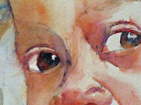
this needed to be absolutely dry as tested by having no residiual coolness to touch before proceding with the features. switching to a #16 round that pointed well i started with the features. i usually start with the eyes or nose, and this was no exception. throughout these steps i used combinations of the same colors as mentioned in the initial wash. i included a close up of my *right* eye for those interested in the detail. these small detail shots should look like an abstract painting in the style of the whole painting if done "right."

from there i moved back and forth from face to background to shirt. i also noticed some drawing errors that i corrected before i got too much paint on the paper surface. the most glaring was my *left* ear was too high (and too long). at this point i decided to stop for a rest and to let the paper dry thoroughly.


a few more features added


this is where i left it tday

Wednesday, December 19, 2012

the end of a long dry spell: landscapes

i have finally finished the work on mounting, matting, and framing the paintings for the show that will be hung january 2, 2013. the hanging wire was the last thing needing to be attached. i may write a blurb about each painting to put in a pedestal book, but we'll see how the time goes.

house near the woods
i have been diddling around with some quick landscape sketches over the last few days. i felt some of my landscape chops needed some work. there were a set of exercises i found in sterling edwards book "creating luminous watercolor landscapes," that i worked through. here are the results. they are not meant to be finished paintings but studies and practice. to this end i think they were very useful. all are about 10"X14"


barn in the field near the woods

adobe in the desert (not near any woods)

Wednesday, December 5, 2012

african girl finish

i didn't do too much more on this painting since the last posting. i basically finished off her braids. the only decision was to go with a more realistic portrayal or more impressionistic. the realistic won out. so i observed where the shadows and highlights were, made a few pencil marks for a guide, and over painted with some modeling. the amorphous shape next to her face needed some darkening. i wet the perimeter with clear water to control the wash and with the board almost vertical put in pretty much pure color at the top and let it run down. the colors were cerulean blue, raw sienna, and alizarin crimson permanent. i  messed around with the shadows on her face a bit but that was really going no where so i decided i was finished.
again i must give credit to steve evans for use of his wonderful photo as a model for this painting.

"she will melt your heart" 11"X14"

Sunday, December 2, 2012

a post of few words but lotsa pictures: new painting

i finished the mounting and matting of the paintings that i am going to use for the show. the printing and most of the punching on the hholiday calendars is done. i needed something to occupy my time while i waited for my frames to arrive and the energy to finish the calendars.

image #1
image #2
detail of eyes
i found a photo by steve evans (babasteve: flickr) of an african girl irresistible and decided to have  go at it while i waited for my frames to arrive. i am not going to go into any detail with respect to the process, but let the photos of the various stages tell their own story. everything is wet on dry and i, again, was determined not to use a tube brown. the subtle coloration of her skin was done with multiple layers of scarlet lake, raw sienna, mineral violet, cerulean blue, hooker's green, and even some ultramarine blue. i am enjoying working through this project. i don't think i am going to do a series of african children as this has already been done so admirably by stephie butler, but this certainly can serve to give me foundation for painting the skin of non-caucasian peoples. so enjoy the photos....a sort of pre-holiday present, if you will.


progress so far, "she'll melt your heart" 11"X15"