 |
| "pine ridge jim" continuing steps |
Wednesday, December 28, 2011
continuing saga of "pine ridge jim" painting
Monday, December 26, 2011
finally! "...fish like a girl"......comes to a close
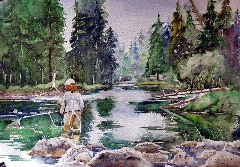 the day after christmas and i finally have had the time to get back to the painting started now probably a month ago of my wife fishing on the madison river in just north of yellowstone. as it turned out i only worked for about 25 minutes and i felt that the painting was finished. here is the result. looking back at the previous post one can see that i added the trees on the right of the picture using a 1" flat brush and the same colors as i have been using for the foliage in the rest of the painting. i finished the reflections in the water using the same brush and colors being careful to keep the strokes horizontal and the edges fairly crisp. the shadow (near) side of the foreground rocks were painted using cobalt blue and burnt sienna mixed ever so slightly on the palette but mostly on the paper after applying with a #8 round brush. the reflections in the water on the near side of the rocks were painted in right away using a darker (for the most part) version of the same pigments. lastly, i spattered the foreground with a dark value of ultramarine blue and burnt sienna using both a large and a small brush to get varied sizes of droplets. i did have to blot some errant ones off of the lighter areas. the water was treated to a graded cobalt blue wash applied lightly to the high value areas of the stream surface trying to get it lighter as i moved forward.
i adjusted a few values here and there after viewing the painting at the stage of the first photo yielding the final result shown below. on to the next project tomorrow which i hope will be the rest of jim from pineridge.
 |
| "yes, she does fish like a girl (and that's a good thing)" 15"X22" |
Monday, December 19, 2011
yes, she does fish like a girl (atagt): following stages
today i had about 30 minutes to paint and decided to start adding the trees and foliage to the right side of the painting. since all of this will be ahead of the distant trees i wanted it greener and darker in value. all of this was painted with a 3/4" flat or #8 round brush. it is always a challenge to come up with a variety of believable greens for landscapes and this was no exception. the standard sort of pine/fir green was ultramarine blue and quinacridone gold. a similar combination was hooker's green and burnt sienna. the somewhat more olive drab green in the center tree was ivory black and cadmium yellow medium as is the dark foliage in front of it that is in shadow near the ground. i put a shadow on the underside of the log and the nearside of the upright branches and the cast shadows of the branches all in one wash that i think was cobalt blue and burnt sienna. i strengthened the values on some of the foreground rocks with the same colors. that's about all i have time for at this sitting. i may get back to it later today. here is where we stand at the present:
 |
| yes, she does fish like a girl (and that's a good thing), 15"X22" |
Monday, December 12, 2011
yes, she does fish like a girl!: continuing
 to start things out today i lifted some of the darker pigment from the far grassy area and over painted with a brighter blend of cerulean blue and cadmium yellow pale. this was the same group of colors that i painted the large mid distance shrub on the right side. all this with a #12 round sable brush. the near bank on the right : ditto. the reflections in the water were painted with a 1" flat sable using ultramarine blue, quinacridone gold, burnt sienna, and hooker's green. i left white areas of reflection from the sky being careful to keep these horizontal. i also painted around the rod and its attached line. i scratched in a few blades of grass and vegetation when the wash was just starting to lose its sheen. that's about all i have time for today as our grand kids are coming over for us to watch while their parents go off for a much needed over night break down the coast a bit to return tomorrow. more then. i will spend the time during the 3 year old's nap sending out my 2012 calendars to friends and relatives for christmas presents rather than painting as time is running short.
Saturday, December 10, 2011
yes, she does fish like a girl! (and that's a good thing): next steps
 i tried tackling the large wash in the upper left above the far bank that represents dark fir trees yesterday. i realized, having slept on the debacle, that the wash was really poorly done. it was too light, uninteresting texture-wise, and had wildly inaccurate outlines. in my defense i was somewhat distracted while doing it as there was pandemonium going on around me with the kids and grand kids. the truth is that i never should have even started under such conditions. the real question now was whether i could salvage it or not.
the predominant change was in value. i don't like to go over large areas of previous washes with darker values if i can avoid it, but i really couldn't avoid it here. the colors were ultramarine blue, quinacridone gold, hooker's green, and burnt sienna. i tried to vaguely emulate the shape of the individual trees in the wash application using a 1" flat sable brush. as i often do with this brush i put one color on a corner and then another on the other corner and then applied to the paper allowing the pigment to mix in situ. i was more careful in getting a believable edge along the clearing that more accurately read "fir trees." i created a few trunks along the bottom by negative painting and then scratched in some branches, trunks, texture with my small palette knife. just to finish this off i sprayed the whole thing with medium to small droplets of water from a small spray bottle.
all in all i am satisfied, if not thrilled, with the overall work. it is dark enough now and reads "trees" better than before. the texture is also more interesting. i am getting some visitors now so i will show that i learned my lesson two days ago and i shall knock off work for now to return on the morrow.
Thursday, December 8, 2011
yes, she does fish like a girl!: landscape with figure
 |
| joan fishing in the madison river, montana |
 |
| first washes and drawing |
 the last 20 minutes or so were spent correcting the figure and adding some distant shore and the far distant trees. the grassy area beyond the figure is a combination of quinacridone gold and cobalt blue. for these steps i switched to a #10 round brush. the undercut bank was ultramarine blue and burnt umber. i put in its reflection right away just under the bank. while i wouldn't ordinarily do this i was curious to see how i might get the tree trunks and deep woods shadows above the bank so i monkeyed around some over on the left side of the painting. this was the same colors as the cut bank. it looks to me like this will work with some appropriate overwashes of the tree trunks. i am going to do the large darker green wash of the trees first however, which would be considered more "proper." the far distant firs were mainly cerulean blue, cadmium yellow pale, raw sienna, and perhaps some touches of the cut bank colors. i made these pale and further lightened and loosened them up with spritzes of water and light blotting. this will undoubtedly make them recede when i put in the darker more well defined nearer trees. i forgot to mention that i also painted the sky with a graded wash of cobalt blue grayed with a touch of raw sienna in the areas where it would show through the trees. at this point i let the painting dry, rest overnight, and ready to have a go at the large dark washes tomorrow.
Saturday, December 3, 2011
keeley and her roadie: finishing steps

i think this painting is suffering from my lack of painting for the last three weeks or so. at the final stages of this i found myself dabbing here and daubing there, not really adding much of any import but certainly running the very real risk of messing it up. also, i got a bit sloppy in the background and i should have planned it out a little better. i usually don't do a lot of planning of a formal nature as i like to experiment and have each painting be a bit of adventure, but this, i fear, is a bit too adventuresome. i don't think it is a fatal flaw and will leave it as is. i will, however, file the thought away for future use. so here are the final two steps in this painting each representing about 20-25 minutes work.
 |
| keeley and her roadie (16"X20") |
Thursday, December 1, 2011
finally, something from oregon
i actually had the studio set up a few days ago, but i got busy right away with a christmas present for my sister pat. i hope she doesn't follow this blog as then the cat will be out of the bag. i'm pretty sure she doesn't. follow along. she has a beloved older springer named keeley(sp?). keeley is epileptic so they rarely leave her alone for any length of time. i had a photo of her (keeley) and pat so i decided to paint a portrait of the two of them. i intentionally made killy larger than in the photo and pulled pat into the background a bit. i won't go over every detail of how things progressed but i will post each step as i finished it and make some comments as deemed appropriate.

nose, right eye, left eye, hair lateral to the eyes, cheeks,
 mouth. the same colors were used in almost every instance (cadmium red light, cadmium yellow pale, and cerulean blue.) the only exceptions were the hair area which were burnt umber and ultramarine blue.


i painted killy with varying colors from pure burnt umber, pure burnt sienna, and pure ultramarine blue to mixtures of any two of them combined slightly on the palette but mostly on the paper.
i used a #10 round brush throughout this painting.
i'm not sure what i am going to do with the background at this point. you an see that i have started to experiment just to the right of killy's head with a light, loose wash of cobalt blue and a little burnt sienna. i think this sort of thing might work with a shape that descends from right to left ending just below pat's *left* ear and ending on the right side of the painting somewhere between her chin and shoulder, but in a light value. this would be more or less the opposite of the head orientation. we'll see.
more tomorrow.
Tuesday, November 22, 2011
battened down in portland
 |
| still life with paint tubes |
i am in the process of getting a studio of sorts set up in the corner of the great room at the place that we are staying. it has great light, but i need to get a drop cloth to foil my innate sloppiness. once that is accomplished, i will be ready to finish up pine ridge jim's portrait. bear with me!
 |
| a drink for all occasions |
are two paintings from a while ago just to dress up the posting.
Monday, November 14, 2011
heading to the great northwest
i have done neither painting, nor blogging in the last week or so as we are preparing for a trip out to portland, oregon, for the holidays. all our kids and grand kids live either in portland or seattle. it will be the first time in about 8 years since we have all been together for thanksgiving and christmas so we are naturally looking forward to this journey. it will take us until about friday (11/18) to arrive in portland as we will take a leisurely approach to the whole thing and it looks like we may get held up just a bit by a winter storm in the northern rockies. this will probably be the last post until i get a studio set up out there, which shouldn't take too long. i am interested in getting back to jim's portrait as i like the way that it has started and at least the drawing has a good likeness of him. some may remember the portrait of spotted elk that i started out in borrego springs earlier this year. i am taking that along and will see what i need to do to get back to painting that as well. the area obviously offers an unbelievable opportunity for landscape, so i will be disappointed if the whole 2 months we are there slides by without taking advantage of it.
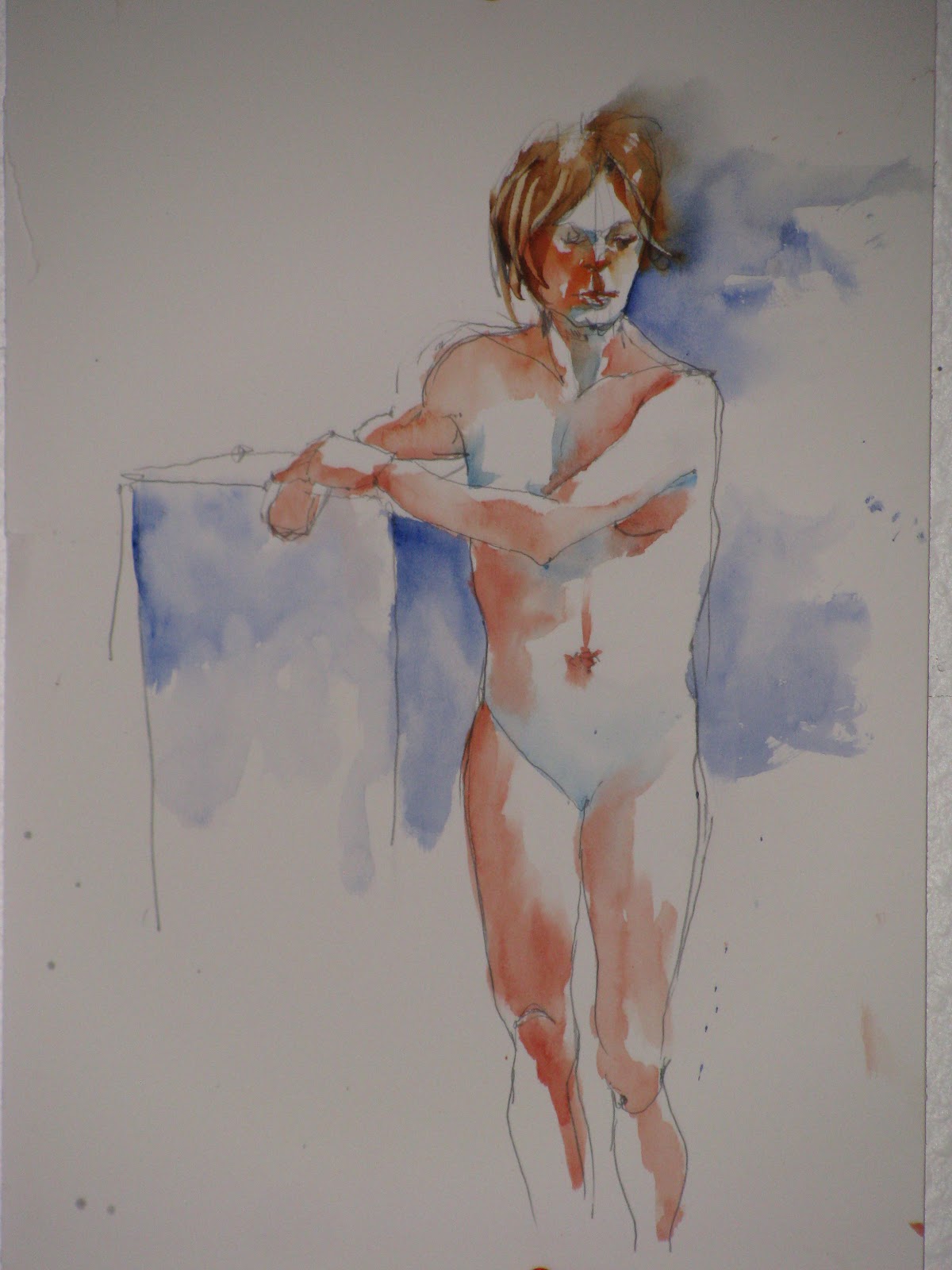
i did manage to get to the life drawing/painting session last week so i do have these last offerings for your viewing. westward, ho!
i did manage to get to the life drawing/painting session last week so i do have these last offerings for your viewing. westward, ho!
 |
| 25-minute pose |
 |
| 15-minute pose |
 |
| 40-minute pose |
Tuesday, November 8, 2011
"pine ridge jim": next painting
this next painting will be a portrait of a fellow i met out in porcupine, sd, on pine ridge reservation, last may. he has a very interesting history having spent a number of years down in australia (or new zealand, i can't remember which at this date) and then moved back to the rez with his spouse. he helps run the clinic building in porcupine which is how we met him. he agreed to the photo that i am using and although the photo was taken inside i am going to put a loose background of the pine ridge countryside in behind the figure. he has had a broken nose in the past and his nose is quite crooked which i think adds great character to his face. this should be fun!
i started with a drawing using the modified contour style on a sheet of 16"X20" 140# fabriano artistico cold press paper and then started the actual painting with the nose and its cast shadow. the colors were burnt sienna and cobalt blue. after putting in a rather dark shape for the underplane, i used a clean damp brush to move the pigment up and over the top planes of the end of the nose and down onto the upper lip. i was using a #6 round brush for all of these steps. i next painted the shadow under the upper eyelid and then the upper portion of the iris. i added ceruelan blue with a touch of olive green for the iris and then used the same procedure for the lower portion of the iris as i did for the nose drawing it down with a damp brush. i put a tie-in with the lower lid right away using the same damp brush but not more pigment. while i waited for this to dry i painted the dark medial shadow in the socket carrying it over the upper lid and below the eye as well. i started this with pretty much pure cobalt blue and moved it around with the flesh mixture by adding the burnt sienna. i painted the lateral socket margin with a lighter wash of cobalt blue blending that into the upper lateral cheekbone area with burnt sienna. adding the hair with a substitute of ultramarine blue for the cobalt right away gave me tie-in there and release of the face shape. by that time the iris had dried sufficiently to just get a bit of bleed with the pupil so i added that with ultramarine blue wet-in-wet carefully painting around the highlight. lastly i scraped in some hair strands with the palette knife when the sheen had come off the wash of the hair.
 |
| first stages of "pine ridge jim" |
life drawing/painting studio: week #7
there were two three-hour sessions this week but i only stayed for about 2 hours in each of them. not too much to say as i went about things the same as usual. for once the longer pose on wednesday was actually better than the shorter one. on thursday the model was clothed so that was a good change from all undraped models. so here are the "sketches/paintings" for this week.
 |
| 35-minute pose |
 |
| 25-minute pose |
 |
| 2-hour pose |
Tuesday, November 1, 2011
"red boots splashing": the finish line is in sight
 |
| near to finishing |
 |
| red boots splashing, 20"X16" |
Monday, October 31, 2011
"red boots splashing": continuing painting
 |
| close up of next steps |
 |
| further steps on the whole painting |
 |
| last steps painted today |
Friday, October 28, 2011
"red boots splashing": another painting
 |
| photo for next painting |
i had obtained some fabriano artistico hot press paper last month when i was experimenting with smooth surfaces. i have played around with this particular brand enough since it arrived to know that i like it so i will use it for this painting. i took a 16"X20" piece and drew the figure of amanda using pretty much the whole sheet and made it somewhat off to the right side to give her *right* arm and hand room to reach forward as shown. here is the drawing which was done with a modified contour approach using a 0.7mm mechanical pencil. here is the result: i artificially darkened the drawing so that it appeared readable in this format. the actual is quite light.
 |
| drawing for "red boots splashing" |
 |
| first washes (more violet than irl) |

i put in the shadow under the *left* side of the hood to blend in with the shape lateral to the socket. i also started to experiment with how i was going to do the rain coat. the tough part won't be the yellow, but deciding how to paint the shadows on the coat/hood. yellow is notoriously difficult to darken. my option will be a grayer yellow (like raw sienna/umber) quinacridone gold right out of the tube full strength, or a green. we'll see what seems to work best in a slightly later step. right now i am leaning toward the green.
i painted the *right* eye the same way as the other. the mouth was done with the flesh colors tending toward the red by dabbing paint in the two corners and middle of the upper lip and after cleaning the brush working that pigment out into the cheek, other parts of the lip and lateral portions of the lower lip. the shadow under the lower lip defines the lower aspect of the lip and was painted with cerulean blue and blended inferiorly with the flesh mixture. the cheeks were painted mainly in the cadmium reds/yellows. as i moved into the neck i added some cerulean. the hair was streaks of quinacridone gold and burnt umber with strands scratched in as the sheen came off the paper. i knew that i wanted some violet in the background to contrast with the yellow of the rain coat and hood so i started with a varied wash just above the hood using ultramarine blue, mineral violet, burnt sienna, and cerulean blue as you see. i didn't want to do any more at this time so i tapered the edges so that i could start back up again later without a hard edge. that's all for now. more tomorrow. be well.
Thursday, October 27, 2011
trempealeau overlook #2: finishing up
there really isn't very much left to do on this painting, but at least the water is pretty important to get right. last time i did this scene , albeit in a smaller format, the water seemed to be on the same level as the figures. in reality it is about 500 feet lower down at he base of the bluff they have arduously climbed to gain this spectacular view. i am going to try to get all the breaks in the shadows as horizontal as i can, try to make sure the reflections are just a bit darker than the hills doing the reflecting, and keep my fingers crossed.
i started with putting a darker value wash along the cliff edge using burnt sienna, quinacridone gold, ultramarine blue, and some burnt umber and a 1" flat brush, which i used for almost all the painting in this and subsequent steps (except where i note otherwise). i flicked in some grass leaves of the same colors and also scraped in some of the same at the appropriate time. for the reflections i used either a combination of quinacridone gold and ultramarine blue or hooker's green and burnt umber/sienna carrying the thin stripes across the paper and adding some watery mix to help the blending. the distant hill reflection that is blueish i put in using cobalt blue and a touch of burnt sienna.
the final steps were to give the foreground a bit of interest and texture by putting down horizontal washes of the same colors used for the water reflections, losing some of the edges, especially the bottom one, putting in some small blades of grass using a #4 round, and, of course, the ubiquitous scraping that i just can't give up. i toyed with the idea if putting a small island just in front of the center figure's head along with some trees, mostly to give the whole thing some scale, but in the end i decided against it. i think it would have had way too high a probability of looking amateurish, the value would have to be "perfect", and i didn't think it was worth the risk.
so here is the end result. overall, i think it is a better painting than the original, leaves some areas that could be improved upon, but accomplishes much of what i wanted and in the larger, full sheet format.
 |
| adding the "cliff"edge and reflections in the water |
 |
| final steps on painting the foreground |
so here is the end result. overall, i think it is a better painting than the original, leaves some areas that could be improved upon, but accomplishes much of what i wanted and in the larger, full sheet format.
life drawing/painting session: week #6
 |
| 20-minute pose |
so here are the offerings for this week:
 |
| 30-minute pose |
 |
| 35-minute pose |
Tuesday, October 25, 2011
trempealeau overlook: continuing steps
 |
| trempealeau overlook: continuing progress |
Monday, October 24, 2011
more landscapes...bigger....better?
 |
| reference photo |
 |
| trempealeau overlook |
 i started this painting by drawing in the figures in the foreground on the paper previously mentioned and then the position of the river and more distant land masses. in keeping with my dictum of painting those things that i figure will give me the hardest time, i started with the sky and some of the distant bluffs. i wanted to get as much aerial perspective into this as possible so i tried to put the most distant bluff in while the sky ( a wash of mineral violet/cobalt blue/raw sienna) was still damp so that the edges would be somewhat blurred. i also made them blue to make then recede. the blue came out a little too "sweet" for my taste but i may be able to tame it a bit later with a light wash of raw sienna or umber. i will wait to do this to make the judgement when the painting is more finished.
 |
| first steps |
 |
| next steps |
Wednesday, October 19, 2011
landscape redux
 |
| timber coulee fishing: before |
 |
| timber coulee fishing: after |
 |
| rabbit trail marsh: before |
 |
| rabbit trail marsh: after |
Saturday, October 15, 2011
next project: "mississippi backwaters"
 |
| mississippi backwaters from the rabbit trails |
 |
| initial washes |
when this had dried thoroughly i painted the trees on the far shore with a variety of colors that you can probably figure out by observing allowing the colors to mingle on the paper much more than mixed on the palette. as the sheen came off of this wash i scraped out the trunks of the aspen/birch.
 |
| next washes |
 |
| "mississippi backwaters" 14"X20" |
Subscribe to:
Posts (Atom)