Tuesday, July 31, 2012

ted nuttall workshop in la crosse, wi

no new painting but i would like to let folks know that we are sponsoring a workshop with ted nuttall, june 10-13, 2013. if any one would like to know more or would like to enroll, please let me know. here is the blurb that we released this week which does have some additional information:


"
2kalispell_158px.jpg

The Eastbank Artists (sponsor) are pleased to announce a workshop by internationally known and highly sought workshop instructor Ted Nuttall from June 10-13, 2013. The workshop will be entitled, "The Portrait and Figure in Watercolor with Ted Nuttall." It will be held in the Kader Gallery in the Pumphouse Regional Arts Center, at 119 King Street, La Crosse, WI. The workshop will be held daily from 0900 hours until 1600 hours with a break for lunch. There will be 6 hours of daily instruction consisting of demonstrations, individual instruction and critique. This workshop is aimed at intermediate and advanced artists.

Those not familiar with Mr. Nuttall's work can find a number of paintings on his website tednuttall.com.

The cost for the 4-day workshop is $500. A 10% discount of $50 will be given to the first 10 registrants. The class size is limited to 18 students and it is expected to fill quickly given Mr. Nuttall's popularity.

To register for the workshop, please remit a $100 deposit (payable to the Eastbank Artists) along with your name, address, e-mail contact, and phone number to Bob Witte, 3424 East Ave S, La Crosse, WI, 54601. This will be considered non-refundable except under cancellation of the workshop.

Any questions can be directed to Bob Witte either by email (witte5730@aol.com) or phone (608-386-1764). 

Further details regarding lodging, materials, and preparative assignments will be forwarded to registrants as the workshop draws nearer." 

Monday, July 30, 2012

the last 30 minutes of "...colleague..."

"surgeon, colleague, friend" 16"X20"
when i got up to the studio this morning i realized that i shouldn't do too much more messing around with the face and concentrated on the jacket and the background. the trick with the jacket was to get the shadows in the folds the right value. too much and they would be too stark and too little and they wouldn't read as much at all.  for the most part i think that they came out okay....a pretty good balance of values. the colors were cerulean blue, raw sienna, and carmine and were painted with a #10 kolinsky sable round. i loaded the brush and placed the tip into the area i wanted the darkest, pressed almost to the ferule, stroked and lifted. this made a naturally gradated stroke. i finished his hair with some ultramarine blue and burnt umber. i tried not to outline the head entirely but sort of dashed and dotted around the periphery and lost a lot of edges with a clean damp brush. i did a minimal amount of scraping this time....i'm so proud of myself! the remainder of the background was pretty straight forward. the warm background to the right side of the figure was a combination of cadmium red and raw sienna (sort of echoing the facial colors) mixed mostly on the paper. i used the largest decent brush i have for this, a 1"sable flat. a slight tint on the switch plate finished this off. one last look left me feeling that the *right* cheek wasn't dark enough so i glazed over a cadmium red light and raw sienna wash. i think this is better. the alarm rang for 30 minutes just as i placed the last stroke. perfect timing. on to our weight training class for old people.

Friday, July 27, 2012

pot pourri: next step in "colleague" painting and life session.

the weather is starting to break and i don't feel quite so lazy. despite that the only things i accomplished painting-wise as to do a little on the painting of my friend and attend the life drawing/painting session at the vitamin studio.

carrying on with "colleague..."
on the painting, i changed some of the mouth around, probably fussing too much agian, with some lifting and repainting and subtly indicating the teeth. i still have continuing trouble with mouths and will look forward to discussing this aspect of things with ted nuttall in september and get his take on this. the main thing was the addition of the gray background on the upper left. i painted this with a 1" flat sable brush and ultramarine blue and burnt sienna. i like to keep some of each composnent evident so what in usually do after rinsing and shaking out the brush put a dab of each color on opposite corners, work the color into the brush on the palette, and then put it on the paper allowing it to finish mixing there. i had to be careful i left an area for his hair (which will be similar in both hue and value). i did this by painting over the intended edges and blotting  the edge with a tissue and then scraping in some strands of texture as it dried. turning to the hand and using a #10 round kolinski brush i painted the rest of the hand and fingers. it is a funny posturing and i actually had to check it out by posing in a mirror to finally understand what was going on. i'm not even sure how he got in that position, but it was so relaxed i think it must be a habit. the key was getting the recesses of the palm to read dark enough but still see the middle fingers. the color were cerulean blue, cadmium red light and yellow pale. the line of his wrist is too thick so i will lift out the inferior part to the base of the thumb and thin it out in a subsequent step.


the main difference here is the shirt. cerulean blue and cobalt blue make up the colors. i started to define his hair with cobalt blue, burnt umber and burnt sienna and then some scraping (of course). i also decided to add a little texture to the dark wall behind him so i will put (and have started to put) some over glazes of the same colors as i move along. the folds on his white jacket were ultramarine blue and raw umber. i did "correct" the wrist and i am happier with it now. i am starting to think this is going to be a bit better than "alright", but i won't get my hopes up just yet.


30-minute pose
to finish out my activities i attended the life session at the vitamin studio. i feel somewhat out of practice due to not attending all that often in the last couple of months. as such i didn't have as much control over the values as i would like. my main goal was to get the correct values and color temperature (along with hard last and found edges) to make the appropriate body part either recede or come forward. for the most part i think that this was accomplished. no prize paintings here but a lot of good practice and experimentation. here are the two best and represent a 30 and 40 minute pose.


40-minute pose

Wednesday, July 25, 2012

LDLD: of old paintings, new paintings, life sessions

this last week has been a bit "helter skelter" for me and i have been bouncing around between doing a little work on the painting of annabel that i started in the demo (and have decided to call "a tale of the lakota"), started a new painting of a good friend and colleague, that i am going to entitle, "surgeon, colleague, friend," and attended the life drawing/painting session at the vitamin studio. so, a "little of dis and a little of dat" or LDLD.

i decided to just post the work as it stands at this time without a lot of commentary. truthfully, the commentary would be minimal even if i decided to go "all in."

next step in "a tale of the lakota"
here is "a tale of the lakota" in its entirety showing the whole paper with a few more details added. this painting is 16"X20" on 140# fabriano artistico cold press paper.

detail of "surgeon, colleague, friend"
here is a close up of the detail on "surgeon, colleague, friend" as well a whole painting view to show the layout on the paper. the painting is also 16"X20" on 140# fabriano artistico paper but the surface is hot press instead of cold press. i am starting to wonder if a bit more seizing on the surface or actually in the paper might be better in terms of the way i paint. i may look into some other brands to see if there is something out there that suits my style a bit better. arches seems to have more seizing than most and indeed is the reason i don't like their cold press surface, but perhaps with the hot press???? we'll see. i am taking a workshop out in seattle in september with ted nuttal and he wants us to use arches hot press so i  might as well get a packet and try it out.


full view of "surgeon, colleague, friend"


recumbent nude model


lastly i will post the only decent sketch from the life drawing/painting session at the vitamin studio from last wednesday. this is a 35 minute pose. the sketch is about 11"X15" on the back side of a failed painting from yesteryear. think it is probably a cheaper 140# cold press surface.


Friday, July 20, 2012

of demos and all the fixin's

status after the demonstration
i had the opportunity to demonstrate painting  a portrait at a meeting of the la crosse arts and crafts society this last week. aside form a mini demo i did for eastbank artists with but 3 people in attendance this was my first attempt at a demonstration. what i learned was that this is a great way to meet fellow artists and have a good exchange of ideas....but... it is a lousy way of making good art (at least for me) as the distraction of talking and painting proved too much for me. the main problem was a lack of concentration at getting the correct ratio of water to paint in the brush. i was continually blotting, adding more concentrated paint, etc. so as you can see mainly a problem of too much water and too little paint. none-the-less i brought the painting home after an hour's work at the meeting and decided to see if i could save it.  i really liked the pose and drawing  and i didn't want to redraw it on another sheet if it could be avoided.  the first photo is the painting after the demo.


first steps in correction
the other things i noticed other than the watered down color was that the paint i used for the red (brown madder) kind of formed "blotches". i'm not entirely sure what caused this but i had noticed it before when using yellow ochre so it might be a characteristic of some pigments. the first thing i did was smooth out the wash on the near cheek by lightly brushing over a slightly more than damp 3/4" flat synthetic brush and lightly blotting with a tissue. while i waited for this to dry, i strengthened the value on her nose. to try to avoid the same problem as before i switched to burnt umber and carmine for my pigments and glazed over the near cheek after the prior "even-ing" had dried. some of the creases around her mouth were not quite the right shape so i scrubbed these out with the same brush and re-painted them in a better spot and with a better shape to convey her somewhat fun loving mood. her far eye was a little misshapen and i corrected that by flattening it out a bit. i added some more hair and changed the colors i was using from burnt sienna and cobalt blue to cerulean blue and ivory black. this produced a brighter color from the somewhat green-gray of the former. i started defining the top of her t-shirt and neck with dark splotches of violet produced by mixing ultramarine blue and carmine on the paper.

final steps of the day

some of these changes are not evident until the last photo at the left. i wanted a complimentary background for her shirt but more analogous for her face so a chose quinacridone gold toned down just a little with raw umber. for what i was attempting i think this is okay for a start. i will probably make it more violet as i move right.

despite the somewhat shaky start i think this is going to come out okay. its a little more "worked" than i like but not overly so. i just realized that the whole page is never shown and i will have to do that next time. as a spoiler, it just has her hands out stretched as she is relating a story so that the face is at the far left of the paper and her *left* hand is at the far right side of the paper.

despite the poorer quality of work that i produced i was overall pleased with doing the demonstration and there were many more pluses than minuses. i suspect that i would get better with practice so i won't shun another opportunity should it arise. that's all for now.


Friday, July 13, 2012

"scouting the badlands": next and final steps

starting point for today's sessions

i had the time this morning to put in some of the last touches on the current painting having done quite a bit a day or two ago.  much of the time before today was spent putting in the back and mid ground. also the badlands structures behind the figure. today the figure needed finishing and i painted the remaining part of his torso and arms. the spear was a combo of burnt umber and ultramarine blue. when i got to this step i thought that the back and mid ground was competing a little too mush with the figure. this was partly due to the values, but also the harder edges, more


next 30 minutes
colorful hues, and general busy-ness. in order to tone it down a bit and to help them recede i glazed over the area from the bottom of the badlands rocks to the foreground hill with a mixture of cerulean with a bit of chinese white. i think that helped and i am not going to fuss with this anymore. i need to remember this ahead of time in the future.


"scouting the badlands" 15"X22"

Monday, July 9, 2012

new painting: "scouting the badlands"

first washes
for this next project i have chosen a photo of the badlands i took while going out to pine ridge reservation of the oglala sioux and an archival photo of a pony-riding scout (from which tribe i am not sure) as inspiration. i combined the two into one drawing on a piece of 15"X22", 140# fabriano artistico rough paper. i started right in on the painting part before i got a shot of the drawing only but i think you get the idea from the first photo after a few initial washes.

second steps
i started the painting on the background forms of the background weathered badlands rock formations. this is a counter to what i usually do which is start with mid- to dark values. in this case i wasn't sure how to paint the badlands so i wanted to see if i could get them right before spending any time on the rest of the painting. i used a gray mixture of cerulean blue, raw sienna, and carmine and painting with a #6 round sable i tried some horizontal stripes of various sizes and hues to emulate the sedimentary rock of which the rock structures are formed. this wasn't quite doing it so i then tried just painting a high value mixed gray wash over the entirety of the structures with the same brush and then lifted off horizontal stripes of varying sizes with a thirsty 3/4" synthetic flat brush. this latter seemed to produce a better result. i then went back to the original hills and did some more lifting. aside from the fact that the value is a bit too dark overall i am satisfied with this lifting technique. i painted in the greenish gassy areas in front of the badlands with hooker's green, ultramarine blue, cobalt blue, and quinacridone gold to "settle" the hills into the distant landscape.


third step
having solved that potential sticking point, i turned to the pony riding warrior/scout and his mount. his face was likely to give me the most trouble so i started there. the colors were cobalt blue, cadmium red light, and raw umber. i used a #4 round brush. and put some daubs of color in the darkest areas and worked them together just as they started to dry. i finished out the head with the hair which was mainly ivory black and lost some of the back of his head into the back ground with a damp brush pulled in the wash. i painted his upper chest with pure burnt sienna with just a touch of cobalt blue in darker areas. the pony was painted in burnt umber, burnt sienna, and cobalt blue using a #10 round brush. the biggest test here was to avoid the white splotches on the appaloosa pony.
fourth step


the sky was painted with the #10 round and cerulean blue over most of the area and with a touch of raw umber for the grayed areas where the clouds were looking just a bit ominous in the far northwest. i generally lay a pretty wet patch down near the top of a white section of cloud with cerulean and blend that in moving upward with the gray of a cloud bottom tapered into the puffy whiteness of the cumulus. then i spritz water at the lower edge of the cerulean allowing rivulets of paint to run down the paper more or less haphazardly and then blot lightly where i think it is getting entirely away from me. i then move to the next higher bank of clouds and repeat the process but on a little larger scale as it is supposedly moving toward me and therefore would look larger. so far so good. i'm sure i'll figure out some major gaff before it is all said and done but for now.........ok.

Friday, July 6, 2012

"father and son": the grande finale

"father and son" 18"X15"
for the one of you who viewed this post yesterday before i realized half of it was "whited" out, i apologize. not sure what happened there as it wasn't that way when i previewed prior to posting???????? i think it is a glitch in the system because it is doing it again on this entirely separate post. here is the finished painting. sorry.

Monday, July 2, 2012

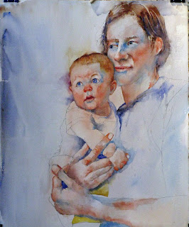
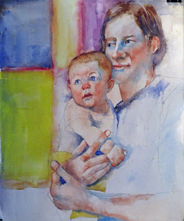
"father and son": carrying on

initial 30 minutes of painting
another hour or so this morning brought me a little closer to finale of this painting. more importantly i made a bolder move than usual to put in a more brightly colored background. the original photo from which i gained inspiration for this effort had a very colorful background wall of what appeared to be tile work with an intricate pattern. i didn't want an intricate pattern but thought the colors would be okay if i got the value and chroma spot on.

in this first session today i worked primarily on ben's hands. before that though, i scrubbed out the upper portion of his upper lip as it seemed too thick (and too defined). not sure where i am going with this at this point, but that will come later. additionally i believe that his head lacks some depth so although i haven't done anything about it yet, i will move his ear back about 1/2" and the back of his head a corresponding distance once i find my trusty "mr. clean eraser." in terms of the hands, i modeled them using cadmium red light, raw sienna, and cerulean blue mixing mainly on the paper. i used a #6 round for this work.  the buzzer just went off which means break time.

next 30 minutes
 i started on the background after about a 20 minute hiatus of guitar playing (still working on croce's "you don't mess around with jim," and "it doesn't have to be that way").  i painted some blurry red stripes about where i wanted the transition from one color to the next to be trying to avoid tangents with the edges of other objects. i used a #10 round and carmine for this. i lost most of the edges of these stripes at this point. the inside of the squares were pretty much the pure colors you see although the ultramarine blue in the upper left was tempered with a touch of raw umber. i am using a 1" flat sable at this point. i'm not fond of the mineral violet next to ben's and atop sollie's head. i think will darken it with some bluer cooler color later. likewise the yellow seems a bit bright. i have been wanting to try an over wash of scrubbed in white over a background that is a bit too exuberant for a while. this may be the ideal spot to try this as long as i am in an experimental (when am i not, one might ask?) mood. i wanted to loosen up (change?) the stripes so i did a little perpendicular scraping along the stripes as the last step in this last session today.