Friday, September 30, 2011

continuing, abandoning, and moving on; next painting

abandoned painting
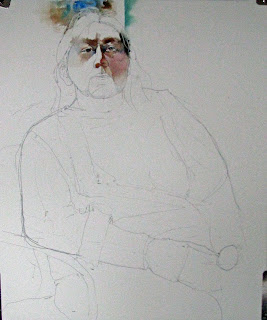
i got back to the painting of marlene yesterday and pretty quickly made a mess of it. i monkeyed around with the background putting in a medicine circle of life, lifting it out, painting over, losing the likeness of the face and making the clothing not really fit in with the rest of the painting technique. so, i flipped it over and started anew. here is the first abandoned attempt:


the second came out better. there is something to be said for finishing a painting in one sitting (with appropriate breaks). i think the technique du jour is consistent. after turning the paper to more of a landscape orientation, i really didn't do anything step-wise any differently. i just paid attention to the likeness as i carefully painted the facial features and tried to make the background and clothing fit in with the rest of the painting. if i am being honest it is a different pose (photo) where she is turned a little to her *left*.  her hands came out a little, for lack of a better word, clunky, but i decided not to fuss with them as they weren't the main focus of the painting. you can be the judge if it really is better, but i am much happier with it. after all it is all about me!

"keeper of tradition"


"just walk away"

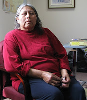
a little while ago an internet artist acquaintance suggested that the seated figure in this painting, that some may remember from a spring posting , would make a good painting in it own right:

yes, i did rename it. i decided that i agreed with him and started on just such a painting earlier this morning.  i started by deciding what to include and thought that the empty lawn chair to his left made a statement suggesting his isolation. i imagined that he was a vet. we have many veterans in this country many of whom after serving our country are homeless and isolated. i will try to portray this.

drawing and initial wash: "victor is a vet"
i chose a piece of waterford 140# hot press paper which is a new experience for me. i am not too sure how it will react and that may be a challenge. i drew the figure and his surroundings directly to the paper and started painting. he is really too far away and his features are in deep shadow so we don't see much in the way of his actual eyes other than the sockets. it would be a mistake to try to make this up so i didn't. i think it is important to make the figure belong to and sit in the scene so i put in some of the backgriound right away so that i could establish some tie-ins,. i have found that if i feather the edges of these swatches one can usually get away with partial washes and come back later to finish them. the one thing that i will say about this paper is that then paint soaks in rather quickly making blending and losing edges more difficult especially if one waits too long and it begins to dry. i will have to remember this as i move along and continually monitor the state of drying.
close up of initial wash: "victor is a vet"

life drawing/painting sessions: week #3


20- minute pose
30-minute pose
i am somewhat chagrined to see that a whole week has gone by since i posted anything. i just doesn't seem like that long ago! well, i am going to remedy that now. the third session of the life drawing/painting sessions happened wednesday evening, september 28.  as usual we had 20/30/45-minute poses after a warm-up. while i thought that i would try to put together a composition out of the 20- and 30- minute poses, i didn't quite manage it. now having tried it twice and failing, i am somewhat in awe of those that can, viz. charles reid.

so i have three separate offerings. as per last week i actually like the two shorter renditions over the longer. in fact the 30-minute one is my favorite of this group and think it actually would be a nice small painting. i thought that i would have enough time to put down an initial flesh-colored wash and rather quickly found that i didn't. after about 10 minutes of waiting, time was drawing ever closer to ending so i went ahead and painted over the still damp paint. it came out pretty dull. on top of a mediocre drawing, the result was not so good, but here they are:

45-minute pose with initial body wash applied

Friday, September 23, 2011

life drawing/painting session: week #2

i went to the vitamin studio for the second time wednesday evening for another session with a live model. the experience is great as are the other artists who work in a number of different media. its always fun to see what someone else does with the same pose. here are my offerings for the week. they were 20-, 30-, 45-minutes poses. i am getting more comfortable with the drawing part and the time management part, but i am still a little sloppy with the paint, a little too dark with the paint, and too red in the flesh tones. also, i think i am trying to put too much detail in the figures. i could understate them and describe some of the contour with negative shapes in the background. "less is more." now where have i heard that before? so here we go:
30-minute (left) and 45-minute poses (18"X15")

20-minute pose (11"X14") 


as you can see i tried to make a composition out of the two longer poses. i think the positions of each of the poses on the paper is okay but i screwed up on the first one by putting in too much background. this left me with trying to over paint a greenish color (that wouldn't lift...believe me i tried) with the flesh color and this created a rather ugly reddish brown. i will have to remember this next week to put down only small swatches outside the figures and lose the outside edge so that i have plenty of room to place the second figure and blend any other negative shapes into the previously applied ones. last comment, the 45-minute pose was a bear to draw with the extreme foreshortening going on from the position from which i was working. by the time i was satisfied (well, as much as i could be) it only left about 18 minutes for the painting...i think i shows...and the drawing isn't so hot either. interestingly enough i think i prefer the 20-minute pose over the other two. it seems fresher and the head is better painted. but it all was a fun, instructive, and useful experience. there is a 3-hour pose session on the first and third thursday evenings of the month usually with a clothed model that i am looking forward to in two weeks. 'til next time.

Wednesday, September 21, 2011

behind the scenes

waiting for papa
despite the lack of posts i have been somewhat busy with a number of things including painting. i spent another frustrating few hours trying to figure out how to get digital video out of the camera onto my computer and into the editing software. doesn't seem to do it on the pc laptop but imovies on my spouse's macbook does at least download the video. i just don't know how to edit it yet in that program and of course she needs the computer so i have to pick and choose the time. the net result of all this is that i have no video to show you yet. i'll keep working on it.
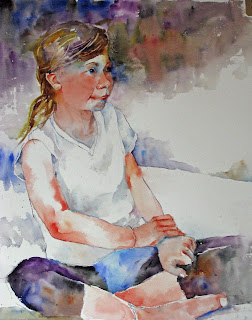
i have done a painting of our granddaughter sophie from a photo i took while she waited for her dad to arrive by plane to take her back to portland after a month-long trip to the wicked grandparents. i was lazy and didn't chronicle the steps as i usually do. here is the finished product:


reference photo
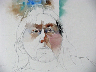
yesterday i started another portrait/painting of a lakota woman i know who lives out on pine ridge marlene. i did one earlier but i wanted to do more of a figure this time and include her hands which are very expressive. i started, as usual, with a modified contour/gesture drawing in hb pencil (i am using a mechanical pencil now as it always stays sharp!) using the photo for the source material. i thought that the main color grouping for the last painting (quinacridone gold and alizarin crimson permanent) was too warm and red so i am going to try to do this one using cobalt blue and burnt sienna for the base flesh colors. also i put down an initial wash last time and i am going to start right in with the features and modeling leaving the white of the paper for the (high)lights.

drawing and initial washes
i started with the nose and painted the under plane with a #6 round and then after cleaning and shaking it damp pulled the pigment both up onto the top of the nose and also down to the upper lip adding a bit more cobalt blue to develop the midtones. the eyes were next using the same colors in slightly different ratios. the sequence that i use for the eyes is the shadow under the upper lid, iris(burnt umber), pulling iris color onto the lower lid with a damp brush, lateral socket plane using mainly cobalt blue, medial socket using a deeper value that is heavy with the cobalt blue and pulling that up over the upper lid and down along the upper medial cheek. i try to make sure all these flow together as one shape except where i leave little islands of paper for definition and highlights. a few notes are in order. on the iris i usually put pretty much pure tube color down over the top third to half of the shape leaving the paper white for the important highlight and then pull the pigment down to complete the shape with a clean damp brush

close-up of initial facial washes
 allowing the shadow shape from the upper lid to mix with the iris color. i put in the pupil with ultramarine blue wet-in-wet when the iris is just damp so that i get a bit of a softened edge. i usually lose the edge of the hair in the temple area so putting in a swatch for the hair and texturing it a bit at this time works best for me. hair color is cerulean blue, burnt sienna, ivory black with texture scraped in when the sheen is disappearing off the wash with a palette knife. the *left* cheek is put in by putting a swatch of carmine down just below the eye and then the whole thing pulled downward using the flesh mixture in rolling back-and-forth brush strokes until i reached the neck (don't stop at the jawline) or ran out of paint, which ever comes first. that's as far as i got today and i will try to be more diligent with the description of the steps as we move along. thanks for viewing/following. please comment if you'd like.

life drawing/painting session tonight so i should have a few offerings from that tomorrow. i am going to try to make a decent composition from two of the longer poses on one sheet......we'll see.

Thursday, September 15, 2011

life drawing/painting session

30-minute pose
i finally found an opportunity for an on-going life drawing/painting session(s). a very talented young artist matt duckett runs a small studio "vitamin studio" in town. he has a 2-hour session on wednesday evenings from 6-8 pm which is mainly undraped models with a couple of 5-minute poses, and a 20-, 30- and 45- minute pose. on the first and third thursdays there is a 3-hour draped session with a single long pose. this is quite an opportunity to paint and draw from a live model so....not entirely a slave to the photo material anymore! here is the output from the first session i attended last evening. these are not very good as i found i was very rusty but by the end of the evening i was getting more comfortable. it is always a challenge when one wants to get some watercolor on the paper in these to manage the time so that is possible. you can see that i did get a little better as the session wore on. sorry but the 20-minute pose photo was too blurry to post.


45-minute pose

Wednesday, September 7, 2011

finishing up a small portrait:"did you call my name?"

"did you call my name?"
it didn't take too much to finish this portrait of safina. i adjusted her far cheek so that it was a little narrower by enlarging the darker background. i extended the background down to the bottom left just above her extended arm to define the top limit of it. i created s few edges behind her neck and finished the hair. the barrette/ribbon was a splash of cerulean (or turquoise blue?) blue. otherwise the rest of this was done with ultramarine blue and burnt sienna. some of the modelling on then top of her arm finished out this last and, i think, final step of this project.  i am fairly pleased with this. the likeness is pretty good and i don't think there are too many places where i overworked it. now the only question remaining, "do i dare post it on brush with water where her grandmother will see it?"

small portrait painting on hot press paper

now that i have been using the lana hot press paper off of a 10"X14" block for my "practice" paintings, i was interested in finding out how that might work with a portrait. i will try to keep in mind the lessons that i learned in trying to stay loose and mixing more on the paper. additionally, i will try the "thirds" approach to the background i talked about on the last post. this painting is of a young woman from a photo that was posted on the site brush with water by stephie butler. i think it is a photo of her granddaughter(?) safina. when i saw it in the reference section of the website i knew that eventually i wanted to paint it. that eventually appears to be today. here is what i have done so far.
"safina" first stages


i won't bore you with the details as i painted this pretty much how i have described in numerous other previous posts. i will say that i am going to try to leave some of the less necessary details understated. we'll see how that goes. i must say that i post this with a bit of trepidation as i consider the subject's grandmother stephie butler to be really good at the understated portrait. i just hope that in the end the result will do some justice to safina's likeness. i will post the final result later today or tomorrow. thanks for following along.

Sunday, September 4, 2011

change is good?

i feel that i have fallen into a bit of a rut lately. as i look back over some of my paintings from the first of the year i think that i have become a little too rigid and controlling. i have mixed more on the palette than paper, used less wet-in-wet, restated and gone back over some areas more and more frequently than i'd like.....overworking. to me, good watercolor should be somewhat raw, "wet", and show a bit of loss of control. those "happy accidents" that people talk about and seem to like about watercolor as a medium rarely happen when one tries too hard to make it do what the artist wants rather than let the medium have a bit of a mind of its own. this of course is arguable and there are those who make perfectly wonderful watercolors that are detailed and pristine. while i can appreciate them for the incredible control, skill, patience that they display in their work, it just is not for me. i find such control and detail to be tedious in its production and have little patience to create it personally. that said, i have been doing a few still life studies where i have tried to remain loose and let the medium have the lead. some of these are small, some are on a different surface than i am used to, some are done more quickly...just a different approach than i have been employing of late. i suppose it started with the painting of sophie and her cat lola. there are areas where is was deliberately loose and perhaps even, one might say, messy. as when one strives to change, the results are likely to be sub-par as one struggles with figuring out just exactly where one is going. there is pain in change and the road to improvement is strewn with many rocks and pitfalls. so, i expect to not like some of this as i try to move forward, but hope the end result will be worth the effort and strife.

here are some examples of what i have been doing and some explanation of what i did to produce each work or effect....good or bad.
"what to choose...what to choose"


this first one is about the same size (16"X20"), the same surface (fabriano artistico cold press, extra white), and subject (still life). the thing that i did differently was to splatter clean water off of the brush on to the surface, across the object just prior to painting it. i have often done this in the middle of a bouquet of flowers in a still life, but rarely with more single, solid objects. i and many other painters feel that each object should have some lost among the found edges and should be "released" into the background or adjoining object somewhere along its expanse. this is just an attempt to put some randomness into the procedure. at times i have just let it be after painting the object and a times i coaxed the paint a bit. while there are areas that i went a little overboard with this, all in all, i am pleased with the effect. i just need to work with it some more.

"plums and lemon with that wine?"
this next one carries on with the clean water splatters, but i was content to leave them alone after painting and rarely did any directing of flow. i guess i am getting more comfortable with the idea. it also is smaller than i have been working lately (10"X14"), a different surface (lanaquarelle hot press 140#), but the same sort of study. i found that the surface was a bit more absorbent than i like or was expecting. it was curious because the cold press of the same manufacturer i find repels the paint. i think i will have to try some other brands of hot press paper before making my final decision as to whether i like working on it. the table that the objects sat on was somewhat shiny and gave some faint reflections. i tried to put those in with the light valued washes in the foreground. other than give some texture to the foreground i am not sure they accomplished much and in my mind do not look much like reflections. to dress up the background, i played around with some geometric shapes with a variety of edges. lastly, i discovered what a lot of artists probably already knew...that sepia is pretty permanent and stains the paper. so i can paint over it with a transparent glaze and it will stay and show through. i used it on on the lettering on the label of the wine bottle. so, lots of discoveries here.

"hard water times in the barnyard"
for the next painting i am going to try doing some more animals and have chosen this photo posted by kay smith from the july challenge on the southwestern/western art forum of wet canvas. i am going to experiment with a technique/concept that i first saw in some of alex powers' works and more lately viewed in bev jozwiak's paintings. that is, putting a dark background in the upper third or so of the surface with a lighter object ( light on dark), a tapering area of dark background in the middle third (more less the same value as the object), and no or little pigment in the lower third of the background (with partially finished somewhat deeper value objects). this is also the smaller size and the same hot press paper. i did some of the same splashing/spattering of clear water over the first rooster before painting it. you can see that i have gotten a bit ahead of myself and for the next step will be drawing the second bird soon! i started with the background using a mixture of ivory black, ultramarine blue, burnt umber, quinacridone gold, carmine, and mineral violet mixed entirely on the paper and applied with a #12 round sable brush (kalish). more on this later. have a great labor day.

Thursday, September 1, 2011

"sophie loves lola": finish

this cat is proving to be a bit of a challenge...as i knew that it would be. i frequently have trouble working my way through new subjects and this is no exception. the only thing that i am happy with so far is sophie's visible eye and lola's extended *left* paw. at this point i am pretty sure that this is going in the round file so i decided to go ahead and experiment with some things as i worked through the difficulties. although lola is not blue and has no blue, oddly enough the color doesn't bother me as much as the need to go over it several times to try to approximate the fur. the paw appears fresh ans spontaneous and the rest of her face is dreadfully overworked. fortunately, i know that there are a number of really well done cat paintings on the web, notably on bev jozwiak's website and stephie butler's blog. i will have to study these a bit a retry this painting at a later date. so, the experimenting that i did was with a looser, darker background that was more abstract than i usually do. i think i accomplished that but i am less sure that it was a good idea for this particular painting. chime in if you have a opinion...anyone? this is a blog striving for transparency (to use a currently popular term) and i will share the poorly as well as the better executed attempts.
"sophie loves lola"


here is the completed painting. its not terrible. its just not very good. i don't feel this as an acceptable outcome and will file it away for future reference. that is not to say it wasn't a useful exercise. i frequently find that the failed paintings are more instructive than the one's that are relatively successful, at least at this stage of my development as a watercolor painter.


just for fun i thought that i would include the small (10"X14", acquabee sketch pad) sketch i did at the eastbank meeting the other night. we had a couple of still life set ups by one of the members. some drew, some painted, some just doodled and gossiped. i took the above sketch pad that i knew would take a watercolor wash, my small cotman travelling watercolor kit and a #6 travel brush. it took about 45 minutes and was actually quite enjoyable. much more fun than the stuffy meetings we all are familiar with and subject to. so there you have it.